Art and The Playfair: Speaking to Absent Volumes, or How to Find Books in the Library, Old Style

During the academic year 2019-20 Rare Books worked with a group of third year students from Edinburgh College of Art.  The project was to produce an artist’s book in response to the collections and space of the Playfair Library room in Old College, the home of the University Library from 1827 until it moved to George Square in 1967. The project ended with a photoshoot in the Playfair a few days before the country was put into lockdown in March 2020.   The project website, which shows all the student work, was delayed by the pandemic, and went live early in 2021.

The challenge the students were set was to make reference to at least one book which had at some time in its history been on the shelves in the Playfair Library. To achieve this they had to get to grips with the records of the collection when it was there.

This really was a challenge. Read on find out why…

How to Arrange an Old Library

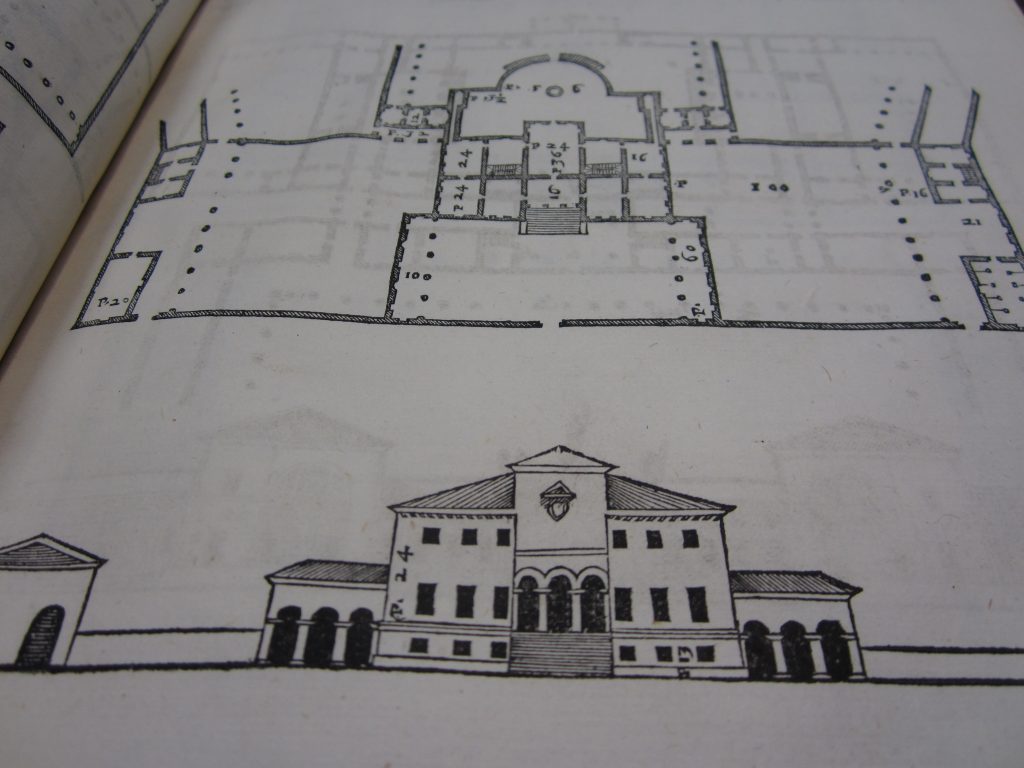
Like many libraries from the Middle Ages until the nineteenth century, the Playfair is a long, narrow rectangle, with windows on both sides, and bookcases projecting into the room at right angles. It is a particularly grand and elaborate example, having an upper, gallery level, which continues the pattern right up to the ceiling.


The books were arranged by what is called ‘fixed shelf location’, meaning that each book had a designated place on a particular shelf. Each bay was labelled with a letter of the alphabet; each shelf was numbered; and the books on each shelf were numbered. This set of three characters was written in the books and in the catalogue, as the means of finding them. Modern libraries tend to use a subject classification scheme, which arranges the books in relation to one another in a linear sequence, whereas in the Playfair the arrangement of the books was defined by the architecture of the library. It was three-dimensional rather than linear; there were relationships between books on shelves above, below and opposite, as well as next to one another. Larger books were likely to be on a bottom shelf and smaller ones in the upstairs gallery.

The books were grouped by subject into the different bays of the library. For example:

A: Bibles and the Church Fathers (Religious books were put first)
G – K – Medicine
L – Natural history
O – Maths and physics
P – Geography and topography
S – Poetry and literature, including songs with music
T – Language; grammars etc.

Although all the books left the Playfair Room in 1967, many of them are still arranged according to the Playfair shelfmarks. Divorced from their original location, these have been run together to form a series of sequences in the Centre for Research Collections’ stores. It is possible to imagine these back onto the now empty shelves in the Playfair, and get a spooky sense of what it must have been like when it was in use.

However, quite a lot books which were at some time in the Playfair have since been given new shelfmarks. Some newer books went into the open-access classified sequences in the library in George Square; others have been moved into different sequences within Special Collections. Books were moved around even when the library was in Old College, and not every book the library owned in the nineteenth century has survived to the present.


How to find Anything

So, for our students to be able to find books which were in scope for their project, they had to be able to tell the difference between Playfair shelfmarks and those from elsewhere in the library, use both the catalogues which record where the books are today and those which record the collection when it was in the Playfair, to detect books which have moved. If they wanted to base their work on an entire shelf, or other grouping, which was something we suggested they might do, they also needed the records of how the books were arranged.

The easiest place for them to look for ideas was the main University library search tool, the familiar discovered.ed.ac.uk – which will find records matching any words typed into it, and can limit its search to anything currently in Special Collections (choose “Special Collections – Main Library” and “Special Collections – Centre for Research Collections” for books which used to be in the Playfair)

So far, so familiar. But a lot of the old Playfair books are not catalogued on DiscoverEd at all, and it doesn’t help much for anything which has changed shelfmark.

The next easiest place to look is in the library’s last paper catalogue, the Guardbook which was closed when computers were introduced, in 1985. This is still used to find anything which isn’t online, and has been digitised. It was originally on typed sheets of paper in looseleaf binders.  Typed only on one side of the sheet, additions were made on narrower sheets, bound to face the page they were adding to.  The whole catalogue is arranged by author, while anonymous works, such as the Bible, go by title.

The experience of using it is very different from searching on a computer. You need to know what you are looking for and you need to be able to look it up in alphabetical order (The trick was to use reference books and bibliographies before trying the catalogue). On the other hand, once you get to the author it is easier than on the computer to browse, to assess at a glance what the library has, to discover the title wasn’t spelt the way you were expecting, or to spot what you wanted in a different version, or as part of a set.

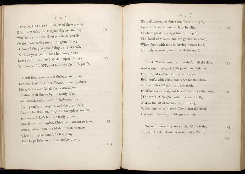
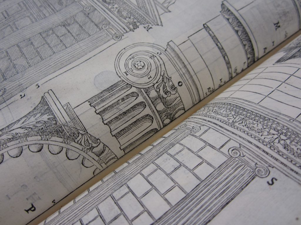
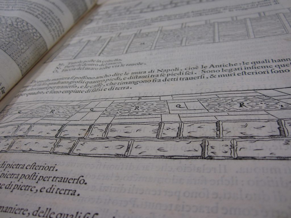
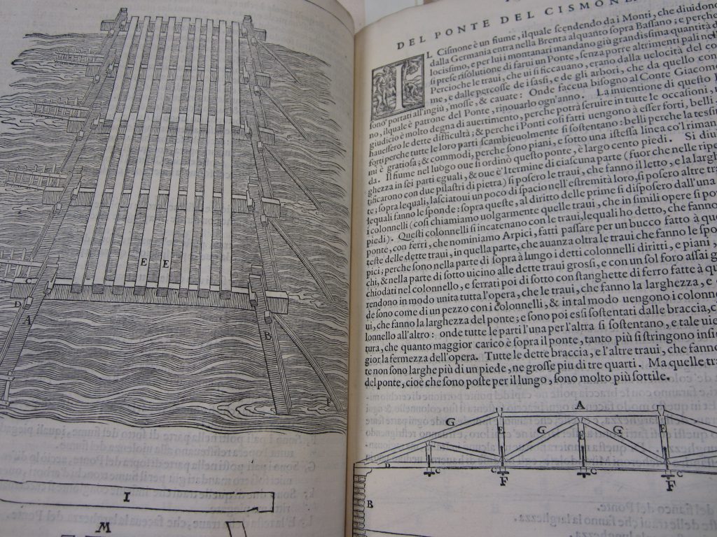
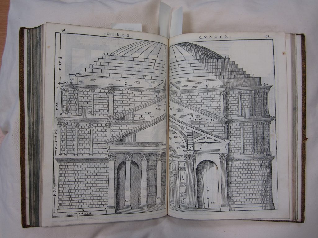
Even the Guardbook records the collection as it was twenty years after it left the Playfair. To reach back to the Playfair’s heyday there are older catalogues. The easiest to use is the one published by the university in three volumes between 1918 and 1923

This is more manageable to use than the Guardbook, even in its online version, and from the point of view of Art and the Playfair, shows the Playfair room in full use, and contains much less material which was out of scope for the project. There are quite a few spare copies of this around, so one was sent back to the studios at ECA, for the students on the project to use.

There was one final, really scary, set of documents for the students to get to grips with…

How Not to Lose Anything in an Old Library

Catalogues, which allow you to find individual books in the library, are only one of the librarian’s tools for managing the collections. The other vital tool is a shelf list; an inventory arranged in the order the books are shelved. This makes it possible to check that nothing is missing, records exactly what is in each volume, if several things are bound together, and helped to keep track of where there was space on the shelves and where new books could most logically be added.

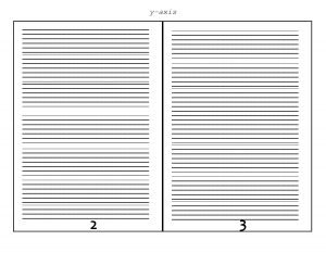
The last set of shelf lists for the Playfair was handwritten in the early twentieth century. These are still in use, though we now work on a digitised copy. They look like this:


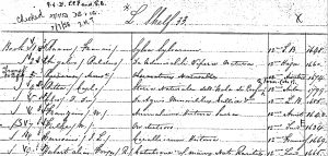
For Art and the Playfair these allowed the students to explore some of the spatial relationships between the books stored in the room, although the handwriting, the crossings-out, and unfamiliar format presented a challenge.

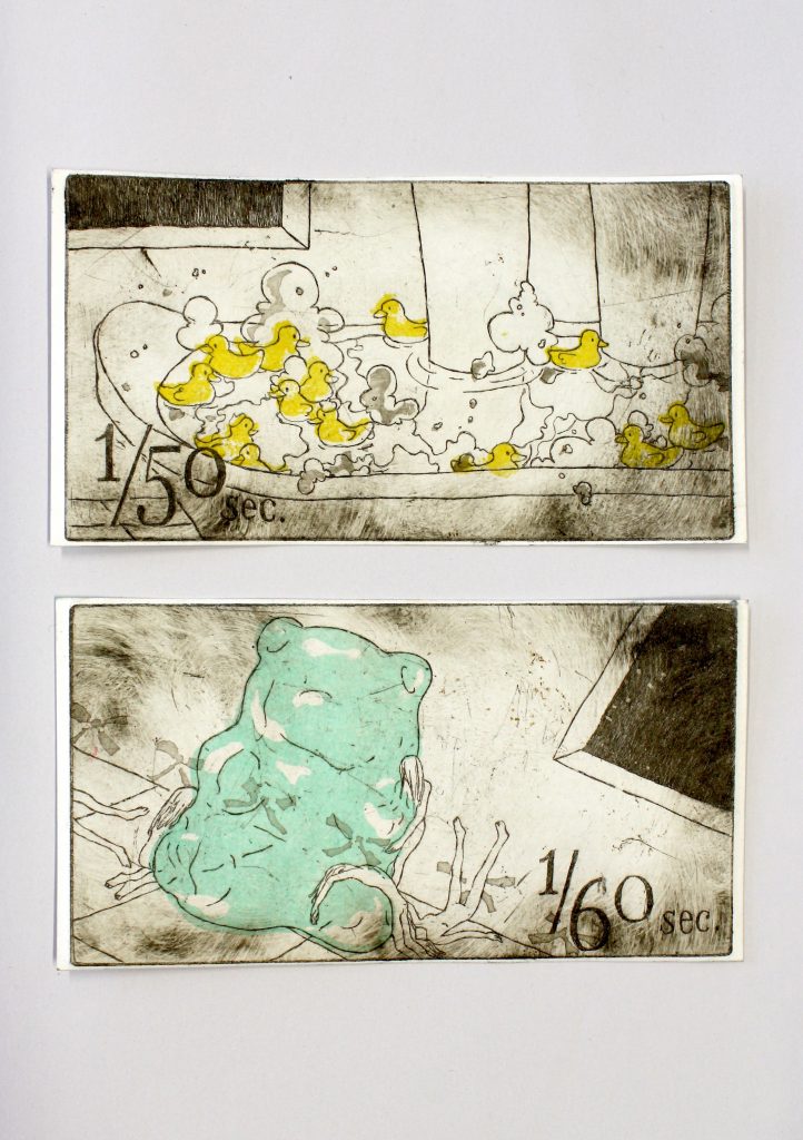
And Then to Make Art

When we set up Art and the Playfair we had no idea how the students would handle this complicated and unfamiliar collection of documents, which as librarians we navigate on a daily basis and take for granted, but were very keen that they should engage with the records and the idea of the library as a space.

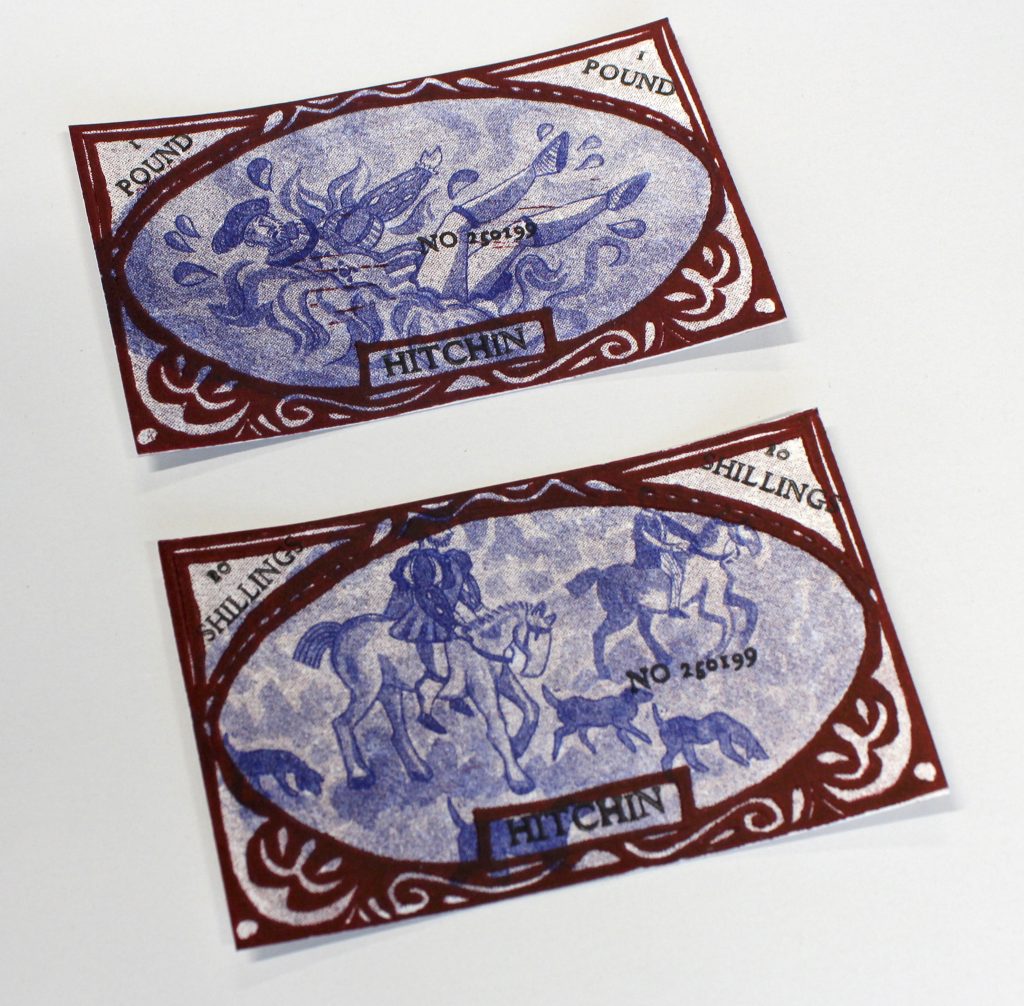
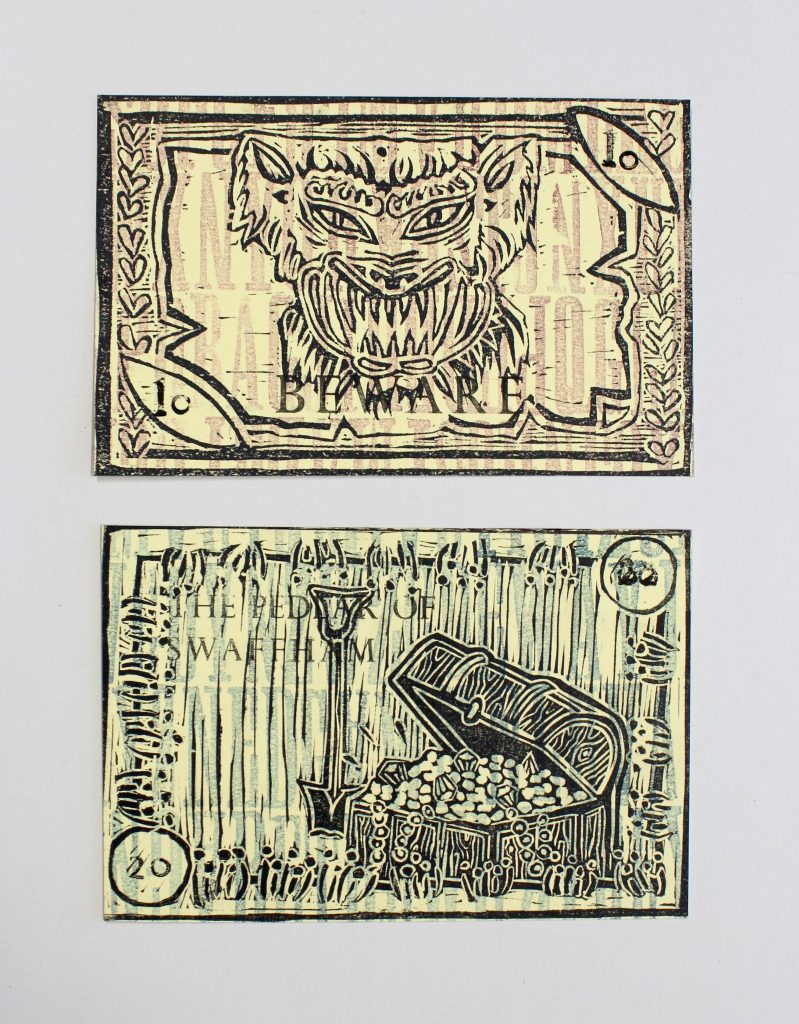
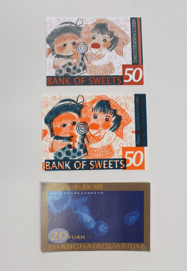
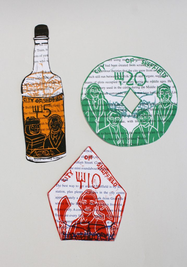
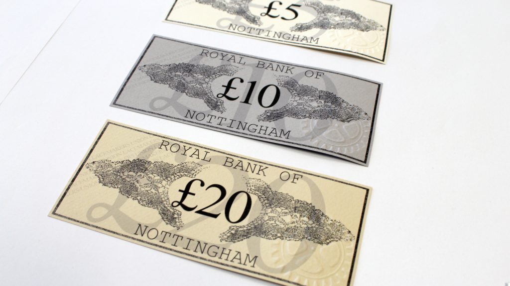
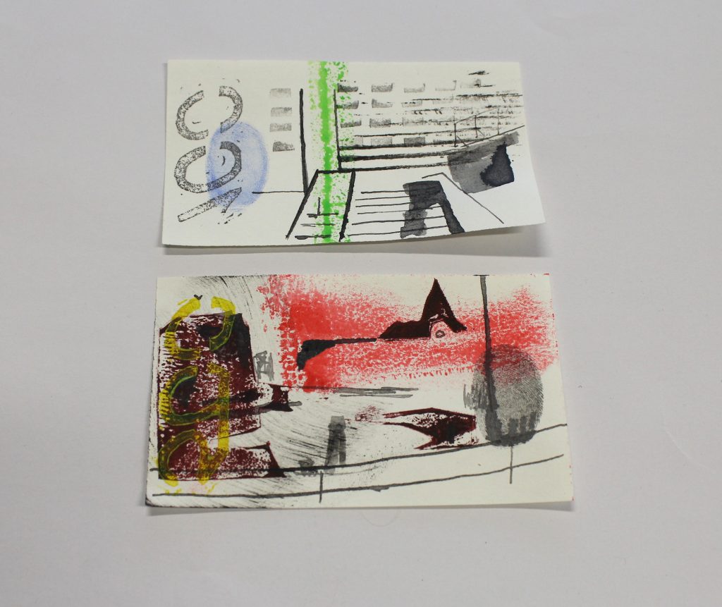
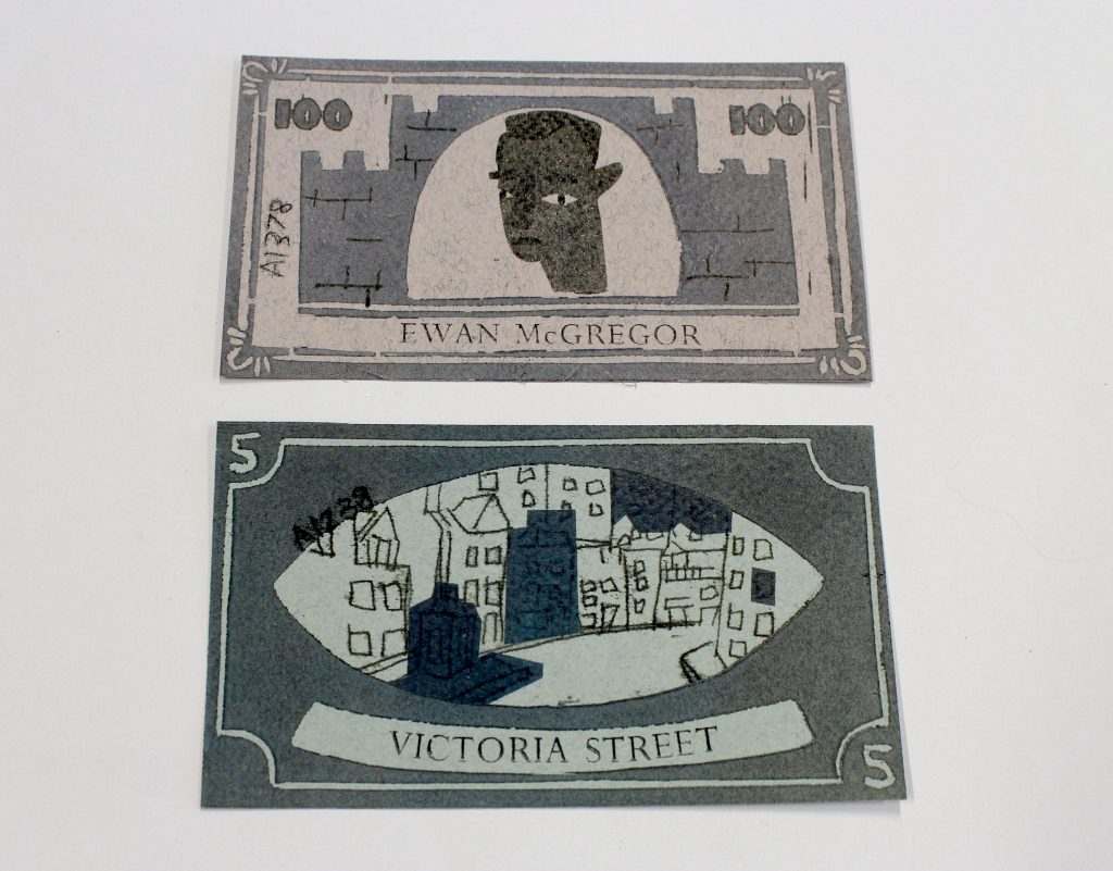
As it turned out, they rose to the challenge magnificently. Their biggest initial hurdle was getting over the surprise that they were not only allowed, but being encouraged, to work with very old books. But once they got started they all managed to find something which spoke to their own interests, and then produce something original and true to their own creativity. We were delighted that few of the books they chose were familiar to us, that some of them really got to grips with the difficult shelf lists, and that so many of them picked up unexpected features of their source material and took it to totally new places.

We wish all of the group well as they approach the end of their degree course this year, and make plans for the future.

Rare Book Cataloguing: The Case of the Blurry Page

Image

Sometimes in rare book cataloguing you come across something that requires you to flex you analytical bibliography muscles. It can be amazing what you can gather from the study of the physical form of a particular volume.
In the following case we managed to learn quite a bit about the printing practices in Cologne during the 1470s from the study of one page.


So, one day I was merrily cataloguing CRC Inc.S.16/2 (De excidio Troiae historia. Not printed after 1472) when I turned a page and found this:

Not actually a bad photograph, but a badly printed page. Possibly what is known as a “slur” where the platen (we’ll get into that later) moves during the printing process and causes the ink to smear. But more likely the platen was lowered twice on the same page, whether on a one- or two-pull press is open to debate.

So far, so what. ¯\_(シ)_/¯

Well, it occurred to me that there was only one mis-printed page. In the printing process there will always be a partner page printed on the same sheet, which is then folded. So, I checked the partner of our mis-printed page and found that it wasn’t blurred. This book was a quarto which meant, as I’m sure you’re all thinking, that that was impossible.

Okay, so a lot of jargon there. Let me break this down.

This is a diagram of a hand-pulled press. Showing the frisket, tympan, forme, press stone and the aforementioned platen.

(Public domain image made available by Smithsonian Libraries (AE25.E53X 1851 Plates, t.7, “Imprimerie en caracteres,” plate 15))


  • Frisket: Used to hold the paper in place on the tympan and to mask off areas that you don’t want printed.
  • Tympan: Holds the paper using small pin-like pieces of metal.
  • Forme: The name given to the frame that the type is tightly packed into.
  • Press Stone: The frisket and tympan are folded onto the press stone.
  • Platen: Is the part of the press that applies the pressure to the paper on the forme.


The illustration above is actually a two-pull press. In this case the press is set up for a quarto sheet with four pages to be printed. The stone is rolled under the platen once, the platen is pressed down printing two pages, then it’s lifted and the stone is rolled further in and the platen is lowered again, printing the final two pages.

In the case of a one pull press, the platen is lowered once. If it’s a folio then one page is printed, if it is a quarto then two pages are printed. After it’s printed, the forme is reset with the next page(s) to be printed.

Now the complicated bit.

Let’s talk about formats. Folio, quarto, octavo, etc.

The format of a book is determined by how many pages are printed on a sheet and how many times that sheet is folded.

So, for example, one sheet of paper is printed on both sides, then folded once.

This is a folio. It’s folded once along the y-axis. Giving two leaves or four pages.

 Front of sheet

Back of sheet

The Folger Library has an interesting website that lets you play with Shakespeare’s First Folio where you can assemble sheets into “gatherings”.

This is a quarto. It’s folded twice. First the y-axis, then the x-axis giving four leaves or eight pages.

 Front of sheet

Back of sheet

Check out this video to see how it’s done.

Octavos are folded three times, giving you eight leaves or sixteen pages. And so on …

Okay now that we’re all experts on formats, let’s stampede over to chain lines.


Chain lines are formed during the paper making process. The mould used to make the paper is dipped into a vat of pulped linen and the water is sieved away leaving behind an impression of the mould.

Check here to see the process.

The mould consists of wire sewn onto supports, it’s these supports that leave the chain line impressions.

Here’s a paper mould.

The thicker, vertical lines you can see are imparted onto the sheet of paper during the paper-making process and will end up looking something like this.

Chain lines help to determine the format of a volume. With a folio the sheet is folded once along the y-axis, therefore the chain lines will be vertical on the page. If there is a watermark (and there isn’t always!) it is placed on the right-hand side of the sheet.

In the example below there’s a watermark on the right-hand sheet and a countermark on the left. When the sheet is folded the chain lines will be vertical and the watermark will be in the centre of the page.

Folio


With a quarto the sheet is folded once along the y-axis, then once along the x-axis therefore the chain lines will be horizontal on the page. The watermark will be in the gutter, often difficult to see, especially in tightly bound books.

Quarto


Phew! Okay, we now have all that knowledge, so here’s why that blurry page is so weird. The chain lines and watermarks in the book show that it is a quarto. And if you remember from before, quartos are printed either two or four pages at a time, so how can there be only one mis-printed page on a sheet? The conjugate page should be mis-printed as well.

When the platen lowered the mis-printed page should have had a mis-printed partner:


If the red page is the mis-printed page, then the green page must be mis-printed because the platen would be lowered on the both at the same time.

No such mis-printed partner existed.

Headaches ensued.

More headaches.

Much sighing.

Light-bulb!

This volume was printed before 1476, we know this because the rubricator (someone who would emphasise areas of the text with red ink) very kindly dated his rubrication. So, it’s a very early quarto. What if the printer viewed printing a quarto like printing a small folio?

Possibly they used a half sheet and imposed the quarto as a folio, and then printed it a page at a time. That would allow for only one page to be mis-printed. We checked the watermarks and chain lines and established that these were indeed half sheets.

Calls went out on Twitter; colleagues were asked for their opinions. Robert MacLean at the University Glasgow put us on to Karina de la Garza-Gil at the University of Cologne who confirmed that the common practice for Cologne printers at that time was to print quartos in half sheets one page at a time.

All that was left was to work out how it happened.

There is no smearing of the ink, and the first printing is sharp if faint. This makes it unlikely that anything twisted or moved, so perhaps the printer lowered the platen once and changed their mind before lowering it with the required force a second time.

The final mystery: was it a one or two pull press? It would be pure speculation to decide either way. Arguments could be made for either. At this point you really need to be able to read the mind of a printer from five hundred years ago. What we do know is that printing quartos on full sheets on a two-pull press became common a few years after this particular book was printed.

In the end what this does show, is how much information can be gleaned from analysing the physical properties of a book. From one mis-printed page we established the printing practices in Cologne from five hundred years ago.

And that end’s the tale of the blurry page!

Rare Books – Expect the Unexpected 5

Wet Monday, Henry VIII Falls in the River, and the Ogre of Smeeth, all funded through the Bank of Sweets.

For our fifth visit to the ECA Illustration students’ Notgeld project we enter the world of myth and legend. Many of the German towns used local legends to illustrate their Notgeld, and several of the students went the same way.

Monika Staachowiak:

For my notgeld project I was inspired by Polish traditions and folklore.
The first notgeld with domination 10pln represents – Lajkonik.
The Lajkonik is one of the unofficial symbols of the city of Kraków, Poland. It is represented as a bearded man resembling a Tatar in a characteristic pointed hat, dressed in Mongol attire, with a wooden horse around his waist (hobby horse). It is the subject of the Lajkonik Festival that takes place each year on the first Thursday after the religious holiday of Corpus Christi. Integral part of the celebration is a great street parade. It demonstrates the victory of Krakow’s residents over the Tatars.

The second notgeld with domination 20pln represents Śmigus-dyngus also known as lany poniedzialek, meaning “Wet Monday” in Polish.
It is celebrated on the first Monday after Easter, and the way to celebrate is actually really fun: you need to pour water on other people.
Traditionally, the boys need to pour water over girls, and they also need to spank them with pussy willow branches, and girls do the same to boys. It is believed that the girl that is most wet or the one that received most amounts of water, has more chances to get married.

The third notgeld with domination 50pln is representing – Masqueraders (carolers).

In the Polish tradition, during the Christmas period, carollers dressed up and walked in the villages from house to house with wishes of prosperity in the New Year. The carolling group wore mascarons, which was often accompanied by comic and frightening scenes and performing various kinds of pranks to spectators. The whole spectacle was accompanied by the atmosphere of general cheerfulness.

Polish folklore. Monika Stachowiak

Petra Wonham:

My Notgeld notes are based on tales of King Henry Vlll in Tudor Hitchin, I have used a variety of techniques to print them such as lino, riso and letterpress, and I have kept to a simple colour palette. The denominations are based on money used in Tudor times.
[Henry VIII used to hunt in the countryside around Hitchin. The Notgeld illustrates the local tale that he fell in the river – either because he tried to vault over it and his pole broke, or he fell off his horse during the chase]

King Henry VIII visits Hitchen, Hertfordshire. Petra Wonham.

Tiggy Wilkes:

Designs inspired by folk tales and superstitions from my home county, Norfolk. The Black Shuck, a werewolf who roamed the coast, The Pedlar of Swaffham who dreamt he found treasure in his garden, and The Ogre of Smeeth who occupied a forest for many years until he was slayed. I created them in an old 18th century style, as if they were warnings and tales to inform the locals at the time.
Created using letterpress and lino relief printing.

Norfolk folklore. Tiggy Wilkes


Our apologies for including this final entry in this post, where it seems not to belong. We had hoped to pay more attention to examples of Notgeld using interesting units of currency.  In post World-War I Germany some Notgeld was produced in unusual materials, including compressed coal dust, and many of the students thought about  their currencies very carefully.  You may have noticed Zhaoyang Chen’s Bank of Rabiland, in a previous post, counted in ‘Caro[t]s’, Naiomi Sun’s Utopian money is issued in units of time, and Rosie Cockrell’s Sheffield runs on units of forks. We thought that Zoe Zhou’s Bank of Sweets took the biscuit!

Zoe Zhou

For me this project is characteristic of time which reminds me of my childhood. In the set every note is quite different because I tried to show different side of that period. One of them is about the lovely children having sweets, rather than money, I believe sweets are valued by them. The other two are about my hometown and my favourite place to go with my parents, the aquarium.

Bank of Sweets. Zoe Zhou

Rare Books – Expect the Unexpected 4

Lace, Forks, The Arctic Monkeys and Golf

This is the fourth in our series of posts based on the current exhibition in the Library Gallery, and the project by Edinburgh College of Art Illustration students, based on the album of Notgeld, emergency money, from the early 1920s.

The original German Notgeld was produced for local use, which was frequently reflected in the design. In an earlier post we looked at student Notgeld which was inspired by landscape and heritage. In this post we feature the work of the students who celebrated local industry and popular culture, often humourously.

Rosemary Cockrell

The city my Notgeld are fo

The Goffr is Sheffield. The notes show different cultural aspects of the city. For example, one of my notes uses the colours red and blue to symbolise Sheffield’s two football teams. The note is a pentagon to reflect the shape of the team badge. One of my other notes is shaped like a Henderson’s Relish bottle, which is a sauce made in Sheffield. My final note is shaped like the Peak District logo.

Notgeld for Sheffield. Rosie Cockrell

The currency I made for the city also expresses an important part of the city’s history. It is inspired by the shape of a fork which symbolises Sheffield’s stainless steel industry.

Bank notes usually have prominent figures featured on them so I included some well-known celebrities who are from Sheffield. I chose Sean Bean, Jessica Ennis-Hill and the Arctic Monkeys.


Jade Hollick

I chose to explore the history of the lace industry in Nottingham looking at the importance of its role within the economy.

Nottingham Lace. Jade Hollick.

Gee Watson

I based my Notgeld on Leith, an industrial area with a lot of history and culture. Inspired by the variety of styles, colours and collectable nature of the University’s collection, I decided to create more abstract, palm sized notes. Using print and mixed media I explored the texture, sound and energy of the area that I call home.

Leith, in texture, sound and energy. Gee Watson

Young Lee

My work is about my favourite activities to do in Busan, South Korea, which is my hometown.

I have invented this special currency that can be used to pay for sports.

Notgeld for Busan, South Korea. Young Lee.

Alison Laing

My Notgeld notes are an example of what the currency may be like if Scotland gained independence. I took a more humorous approach when exploring themes of architecture, royalty and famous Scottish figures whilst using a strict colour palette of blue, white and black.

Currency for an independent Scotland.


The exhibition includes a few items which are unexpectedly humourous, for a University Library.  The one which perhaps best complements this group of student Notgeld is the humourous poem about golf The Goff.  This, incidentally, like Gee Watson’s Notgeld, is set in Leith.  It records, in mock-heroic verse, a match between a young Edinburgh lawyer and a bookseller, on Leith Links.  In the passage reproduced below they see a group of senior players – the great and the good of Edinburgh – described as if they were the heroes of legend.

We are not sure whether ‘Golfina’, the goddess of golf, is present in modern Leith.

The Goff


Rare Books – Expect the Unexpected. 3

Hippogriffs, Rabbits, Skyship Ports and Mars: Fantasy Worlds

In our third visit to the student Notgeld and its connections with the exhibition, we move into the realms of fantasy. Some of the students realised that while their Notgeld needed a sense of place, they could improve on the world we have, and design for a better one.


Let us start by letting Naomi Sun lead us to the best of better places: Utopia:

“Here is UTOPIA.
A place for you to escape from the REAL.
You can finally be YOU,
though that will not be long.”

“Tickets are limited.
Please collect your notes and use them wisely.”
We were particulary impressed with Naomi’s work, as she was the only student to use etching to produce her notes.

Sammi Duong looked to Space, and made a better world on Mars:

“These banknotes are made for a future when we inhabit Mars and are named after the Mars Rover. Together they narrate the process in which humans made Mars habitable.
They were made digitally on Photoshop then risograph printed with red and gold ink.”

Zhaoyang Chen invented a world of rabbits.

“I designed these notes for an imaginary country populated by rabbits. The name of this country is Rabiland, I got the inspiration from Zootopia. The design and layout of the notes are based on modern Chinese notes.”
These also explore space: the third note of the set, which is in the exhibition but not illustrated here, shows the rabbits in very natty space suits.

Shannon Law and Valeria Mogilevskaya have both invented imaginary lands.

Shannon:

“My notes (Oceys) are for a fantasy fishing village that I based around some creative writing that my friend and I worked on. It originally was a market town with watchtowers surrounding it, I changed this due to the colour palette I was using and the style of buildings that were evident in medieval fishing villages.”


Valeria

“Ythers’Narth is a fictional country in a steampunk world, it is a mountainous and beautiful country which presents a scenic idyllic lifestyle to the rest of the world but in reality the strict laws and controlling government make life there far from free. These notes, issued by the capital city and carefully monitored by the nobility show parts of the country people are meant to look up to – the rich history and older civilization Ythers’Narth gets its name from and its people are descended from; the picturesque mountain ranges and fields of golden wheat; the immensely popular sky ship ports that people from all over the world fly to.”

The other exhibits some imagined lands – there are the examples from our collection of American comics, Batman, Spiderman and the irresistably-named “Ms. Tree”, which we cannot reproduce here for copyright reasons.

However, we can reproduce a fantasy creature, which would be worthy to inhabit any of the students’ fantasy lands. A hippogriff, from Ludovico Ariosto’s Orlando Furioso. In the story the knight Astolfo travels by hippogriff to Ethiopia (which is clearly off the edge of the page), to seek a cure for Orlando’s madness, brought on by being jilted in love.

Hippogriff, from Orlando Furioso

Rare Books – Expect the Unexpected: 2

Satire

This is the second in our series of posts based on the current exhibition in the Library Gallery, and the project by Edinburgh College of Art Illustration students, based on the album of Notgeld, emergency money, from the early 1920s.

Some of the original German Notgeld was satirical, containing harsh commentary on the world which created it. One of the students picked up on this idea, and produced a set of notes commenting on current U.S. politics. Rachel’s puns on the names of politicians, her comment the state of the economy and political institutions are all completely in the spirit of the satire used on the original Notgeld. What she did not know was that one of the other items in the exhibition contains satire just as biting, but four hundred years older.

Rachel Berman: Politics and Hyperinflation


“The starting point for my project bloomed from two persistent themes within the presentation of the authentic Notgeld: Politics and Hyperinflation.
Indeed, as an avid political cartoonist, I was intrigued by these notions and was compelled to apply these elements to the contemporary context.

For this, I imagined a near dystopian futuristic USA (2019 to be precise), in which our current Supreme Leader has rewritten the course of history by converting the US Dollar to the US Donald.  This rookie mistake has resulted in extreme hyperinflation, to the point where 1 Dollar now equates to 100 Donalds.

Furthermore, our Leader-in-Chief has decided to rename the US Penny, the US Pence (after his Vice President Mike Pence) and the US Nickel, the US Kavanickel (after his newly appointed Supreme Court Justice).

Additionally I have played around with several details on each note/bill.

For the Donald, I have altered the numbers to read 007, a reference to James Bond, with whom the President believes he shares a likeness.

For the Pence, I have swapped the ‘United States Federal Reserve System’ with the ‘National Rifle Association’, as the latter bared a strong resemblance with the former and better depicted Mr. Pence’s values.

Finally, for the Kavanickel, I wanted to have this used as a legal acquittal for all ‘past’ offences. For this I modelled the colours after the Monopoly ‘Get out of Jail Free’ card. It is no secret that Judge K’s past has been tainted by many credible allegations of sexual assaults. Despite this, however, he, like many other white men, has managed to evade the consequences of his crimes. I wanted to pay particular attention to this white male privilege and illustrate this section of society’s entitlement mentality.

In conclusion, I added a cheeky ‘Made in China’ label to hone in on the blatant fact that our industries are being overrun by the Chinese government, and that despite Trump’s rhetoric, we are NOT number one.”


There is another piece of trenchant satire in the exhibition; Robert Parsons’ (sometimes known as Persons) response to the edict of Queen Elizabeth I against the Catholics of England (Cum responsione ad singula capita… Elizabethae, Angliae Reginae, haeresim Calvinam propugnantis, saevissimum in Catholicos sui regni edictum, 1592).

This has much in common with Rachel’s Notgeld, and much of contemporary political satire. Firstly it was calculated to gain the maximum circulation, in this case by being written in Latin and published in several European centres simultaneously.  Latin was then the language for international communication, much as English is today, while the modern means of gaining wide coverage is, of course, to publish online. Parsons’ satire gains its effect by using all the techniques of argument which were appreciated in the sixteenth-century; complex formal rhetoric, references to classical literature and the Bible, and contemporary ideas of the ridiculous. The modern equivalents are the punning jokes, references to contemporary popular culture and vivid images, which Rachel exploits to the full.

The background to Parsons’ book is the attempted invasion of England by the Spanish Armada in 1588. In the aftermath a proclamation was issued by the English crown, though actually written by the Lord Treasurer, Lord Burghley, accusing English Catholics of being in league with the Spanish against the English state, and English Catholics living abroad as being dissolute criminals. The response was a co-ordinated and sophisticated series of publications from the English Jesuits in Europe, culminating in this.

Parsons avoids attacking the Queen herself, concentrating instead on the ministers who were responsible for the legislation. His style is to make them ridiculous, by interpreting their actions and beliefs as monstrous and re-telling events to make them preposterous (according to some modern commentators his was a more truthful account than the official English version of the story). He points out the ministers’ extra-marital affairs and controversial religious views, as making them unfit to legislate on religious matters. He compares them to evil politicians from English and Biblical history.  This is a very similar approach to Rachel’s satire of contemporary politics, with the exception that it depends on words, rather than images, for its impact.  We live in a much more visual world than the Elizabethans did: easily-transmitted film and photographs give the modern satirist possibilities for visual jokes which depend on the audience recognising the victim.  Rachel exploits this to the full in her Notgeld, but it was something which was not open to Robert Parsons.

Rare Books – Expect the Unexpected. 1

Quote

A Sense of Place

If you have been passing the Main Library recently you will have seen the exhibition in the Library Gallery on the ground floor, of some of the more unlikely things to be found in the Library’s Rare Books collections. One exhibit you should not miss is the first thing you come to – the project by students of Illustration from Edinburgh College of Art (ECA), based on an album of German “emergency” banknotes from the years after the end of the First World War.

The schedule for printing the exhibition catalogue prevented us from including any of the student work in it, and in the exhibition itself we only had space for a selection of the student work, and none to include their own commentaries on it.

When we saw the students’ projects, one thing which struck us was how many of them  link with items in the exhibition other than the Notgeld.   These are entirely fortuitous connections; none of the group knew what the other exhibits were.

In this series of blog posts we want to showcase the student work, including the ones we couldn’t fit into the exhibtion, and make some of the juxtapositions with other exhibits which struck us when we were assembling it.


Notgeld

In Germany many local authorities issued “Notgeld”,  “emergency money” during and immediately after the First World War.  Initially, the diversion of all available metal to the war effort had caused a scarcity of small change.  Locally-issued, low denomination notes, enabled the everyday econonomy to continue to function, even though they had the status only of tokens, and had no national authority behind them.  They continued to be issued after the end of the war, into the early 1920s, when they were no longer strictly needed, but had become collectible.  These notes were generally very attractive, celebrating the history, industry or culture of the locality which issued them, although they were sometimes satirical or contained propaganda or political messages.  In our collections we have two albums full of notes from this late period, from all over Germany.

The ECA third year Illustration students were set a project to design their own Notgeld, exploring the features of the original Notgeld, looking at money and currency more widely, and developing their own ideas.  They had to print their notes, using any printmaking technique available to them; some of these are referred to in their descriptions.  (Risograph is a digital duplication and printing system, which builds up an image with layers of ink in different colours.  The results are similar to screen printing)


The celebration of place is a strong theme in the original Notgeld.  This was explored by the students in a number of different ways.

Several used the landscape, landmarks and distinctive features of their home towns.

Celeste John-Wood

My ‘Notgeld’ notes are designed for imagined use on the South Downs Way, a long distance national trail running through the South Downs in Sussex. The wildness and variety in

the environment inspired me to choose this location, and provided a rich resource from which I could develop my imagery and portray some key sites. For my notes, I aspired to create three very different denominations, portraying the contrast in the landscape and present a sense of each place’s distinct history. I have depicted Devil’s Dyke, the Charleston house (home to the Bloomsbury Group) and the Seven Sisters.

Daisy Ness

For my currency inspired by the German Notgeld, I chose my home of the Isle of Wight to create my notes for. I wanted to combine some of the local landmarks, such as Osborne House and the Needles, with the element of nature to create my work. To achieve the clean and precise look I was after, I decided to risoprint my design.

Lydia Leneghan

My inspiration for my notgeld notes was my hometown, Kilkeel, which is a small fishing town in Northern Ireland. My notes feature the most iconic parts of the town: the faerie trees, the harbour, and the legendary fish and chip van which is known across the country.

Philomena Marmion

Kaunas is the second biggest city in Lithuania. Founded in the 14th century, the city has gone through many changes: an important city in the Grand Duchy of Lithuania, part of the Russian Empire, the temporary capital of Lithuania during the Interwar period, a city in the Soviet Union. Now Kaunas is in a cultural upheaval preparing for the role of the European Capital of Culture for 2022. All this history has left a mark on Kaunas and made it into the quirky, welcoming city that it is today. This set of Notgeld aims to show the special spirit of Kaunas by including elements unique to it: the green trolleybuses, the bison statue in the Oak Park, and the smiling sundial all with a backdrop of Soviet blocks of flats that make up the suburban areas of Kaunas.

Admirable Geometry

This week’s guest blogger is Hannah DeWitt, from the University of Edinburgh, School of Languages, Literatures and Cultures.

Francesco Barozzi, Admirandvm Illud Geometricum, (Venice Apud Gratiosum Perchacinum, sumptibus Io. Baptistæ Fantini Patauini, [1586]  (Edinburgh University Library *O.21.3 and *O.21.4)


This week’s look at Venetian Images encounters mathematical figures that have remarkable continuity with modern textbooks.

This text, Admirandum Illud Geometricum, was written by the influential Italian mathematician and astronomer Francesco Barozzi (1537-1604). Barozzi was born in Crete. He studied at the University of Padua and later lectured at the university. He is known for his efforts revive science and maths through re-examining the work of ancient mathematicians and philosophers. His work includes new interpretations and applications of ancient theories, particularly those of Euclid. Previous to Admirandum Illud Geometricum, Barozzi translated and added commentary to Euclid’s Elements in Procli Diadochi (1560). He also translated texts by Archimedes and Hero.

Barozzi led a tumultuous private life. At university, he was accused of taking someone’s hair without consent, an act that has been suggested to be linked with occult practices. Later in his life he was convicted by the Inquisition of an unknown charge. He was accused and tried for causing a terrible rainstorm in Crete. Eventually he was convicted and fined for sorcery. His translations of Nostradamus and interest in predictions contributed to his reputation for engaging in occult practices and his final conviction essentially ended his academic career.

Admirandum Illud Geometricum is an exhaustive instructional text detailing thirteen different methods for producing parallel lines on a plane. While Barozzi more typically worked on translation or commentary, this work is original, though it does frequently reference ancient mathematicians and classical theories.

While the more interesting images are the mathematical figures, the title page printer’s device belonging to Gratioso Perchacino of Venice is worth mentioning. This woodcut of a winged serpent on a pole is most immediately associated with the caduceus, the staff of Hermes with two snakes and wings that is commonly misused to represent medical practices. The staff of Asclepius, the god of medicine, is meant to have one snake and no wings it the symbol which is appropriately meant to represent medicine. But as in the Barozzi image, it is often mixed with characteristics of the caduceus. Included in the device is “SALVS VITÆ” or “The Help of Life.” This phrase is frequently associated with the Roman goddess, Salus, the goddess of health and well-being.

.

The most impressive images in the book are full page renderings of mathematical compasses. These are simple images with enough detail and exacting scale to elicit a startling recognition of similarities between and lack of change in the depicted compasses the modern versions of the same tool. It is also very likely that the exact dimensions of the woodcuts themselves were created by tracing the figures with similar tools.


All other images in the text are mathematical diagrams. Some of the figures appear more than once, with identical figures appearing up to four times. The image below appears three times, but is made by two seperate woodcut blocks.  It appears on two sides of one leaf and again on a leaf printed separately. In order to duplicate the images this way, the printing block would have needed to be painstakingly carved a second time. This suggests that the printer expected to print the images at least twice on the same side of the same sheet, but it wasn’t necessary. This effort emphasises the importance the author attributed to having the image visible for each point made about the diagram.This process is duplicated throughout the text, but the difference in these particular images is made obvious through an error. The first and third image were printed using a block with an error, a backwards ‘K,’while the second image is identical in scale and precise measurement, but has a correctly facing ‘K.’


A second set of figures has a similar error. The three images appear on the same sheet in this instance, making the use of two blocks necessary. In these figures, a ‘N’ is inverted.


While a majority of the images had the lettering carved into the woodcut, a few used type. This can be seen in diagrams labeling the names of the shape.


As the text progresses, the complicity of the figures and lessons increase. These more complex shapes frequently build on a simpler figure. In order to achieve the precision of these diagrams, the first image would have needed to be traced or carefully measured and redrawn before adding the new elements of the second, more complex printing block.


The variety and replication of the diagrams attest to Barozzi’s particular dedication to images as part of his teaching method.


Two copies of this edition of the book are owned by the University of Edinburgh. One is bound in a light vellum binding and the other in a dark, ornate leather binding. The first copy (*O.21.3) bears no indication of ownership previous to the university. It has an 18th century Edinburgh shelfmark suggesting that it arrived in the second half of the century.

The second copy (*O.21.4) is more expensively bound and is stamped with a gilded owner’s stamp belonging to Sir John Rivers, 1st Baronet, who died in 1651.  Rivers’ books, with this memorable stamp are scattered among a number of libraries in the U.K. and U.S.A.  The signature of a second owner, C Hutton 1785, can be found on a flyleaf. Hutton was Professor of Mathematics at the Royal Military Academy in Woolwich, and would have had an obvious interest in .

The precision and frequent duplication of images are unique to the care Barozzi shows in having this text printed. His dedication to what he believed was the superiority of mathematical certainty is evident in the attention to detail and effort placed in producing his diagrams.


Hannah DeWitt

University of Edinburgh

For references and further reading:

https://www.maa.org/press/periodicals/convergence/mathematical-treasures-francesco-barozzis-procli-diadochi

http://www-history.mcs.st-andrews.ac.uk/Biographies/Barocius.html

https://www.encyclopedia.com/science/dictionaries-thesauruses-pictures-and-press-releases/barocius-franciscus

http://data.cervantesvirtual.com/manifestation/289947

https://www.british-history.ac.uk/no-series/court-of-chivalry/559-rivers-bowton

http://emlo-portal.bodleian.ox.ac.uk/collections/?catalogue=charles-hutton

Travelling Images: Venetian Illustrated Books 3

This week the exhibition curator, Laura Moretti, of the University of St. Andrews, writes about the finest, and probably most famous book in our selection: Andrea Palladio’s “Four Books of Architecture”. 

Andrea Palladio,  I Quattro Libri dell’Architettura, (Venetia: Dominico de’ Franceschi, 1570)  (University of Edinburgh Library, Special Collections, Smith.1594)

Andrea Palladio (1508-80) first published his I quattro libri dell’architettura in Venice in 1570, in the printing shop of Domenico de’ Franceschi (fl. 1557-75), publisher and book dealer from Brescia, at the sign of “Regina Virtus” in the Frezzeria. The book enjoyed extraordinary fortune, through its numerous editions and translations, becoming the main channel of the widespread knowledge and appreciation of his author’s work.

Title page detail

Palladio already had important experience in the field of book publishing. In 1556, Daniele Barbaro – a refined and sophisticated Venetian patrician, and already the architect’s patron and supporter – put through the press a translation with commentary on the architectural treatise of the Roman author Vitruvio, complemented by Palladio’s lavish illustrations.

In Palladio’s treatise, the subject matter is subdivided in four sections: the first book – dedicated to a friend and patron, the Vicentine Count Giacomo Angarano – discusses the fundamental principles of building and the five architectural orders; in the second book Palladio presents his portfolio of projects for residential palaces and country houses, and reconstructions of ancient Greek and Roman houses; in the third book – dedicated to the Prince Emanuele Filiberto Duke of Savoy (1528-80) – the architect treats roads, bridges, squares, basilicas and other public buildings; while the fourth and final book is dedicated to antique temples in Rome and elsewhere, in the Italian peninsula and beyond. Book One, Book Three, and Book Four also contain introductory letters to the readers.

Book 1. The Composite Order


Book 1. Stairs


Book 2. House of the Greeks (detail)


Book 4, detail of the Temple of Portunus

The edition is finely illustrated: all the books are introduced by a full-page woodcut and illustrated by numerous diagrams and architectural details. The relationship between words and image is heavily weighted towards the latter. The text is often used to explain and elucidate the drawings, and frequent lists referring to corresponding details in the illustrations provide precise terminology and further interpretations. The drawings frequently present measurements, which give a clear sense of the proportions between different architectural elements. Palladio very rarely makes use of perspective: the only exceptions are constituted by the description of brick courses and layers in Book One, and the representation of Caesar’s Rhine bridge in Book Three.

Book One, detail of brick courses.


Book 3. Detail of Caesar’s Rhine Bridge

The majority of the drawings are plans, elevations or sections, variously articulated in the page layout. Contextual elements defining the buildings’ surroundings are rare and limited to some schematic representations of water and occasional exemplifications of soil. Shadows are consistently employed to confer profundity to the architectural elements, from the depiction of minute details to the outlines of massive buildings. The potentialities of the medium are fully explored and used at their best.

Book 4. The Pantheon


While in the depiction of ancient buildings Palladio shows an obsessive attention to the accuracy and faithful rendering of detail, the representations of his design projects present elements of greater complexity. More than faithful copies of the completed buildings, they seem to be idealizations, perhaps the architect’s successive reflections or maybe the sign of ideas not fully executed.

Book Two, Villa Godi, Lonedo di Lugo di Vicenza


The copy now preserved at the University of Edinburgh comes from the library of Adam Smith FRSA (1723-90), the Scottish economist, philosopher and author, and a key figure during the Scottish Enlightenment era. The University of Edinburgh holds about half his original library (850 works in 1,600 volumes), including books on politics, economics, law and history, but also many literary works, particularly French literature, and books on architecture.


The full catalogue record for our copy can be found here: https://discovered.ed.ac.uk/primo-explore/fulldisplay?docid=44UOE_ALMA21147069860002466&context=L&vid=44UOE_VU2&search_scope=default_scope&tab=default_tab&lang=en_US


Travelling Images: Venetian Illustrated Books 2

This week our Venetian illustrations turn theatrical, with an illustrated copy of the plays of Plautus, and we welcome as guest blogger, the exhibition curator, Laura Moretti, of the University of St. Andrews. 


Titus Maccius Plautus (c.254-184 BC), Comedies, edited by Bernard Saraceni, and Giovanni Pietro Valla. (Venice: Lazzaro de’ Soardi, 1511).  Edinburgh University Library JY 1082.

The comedies by the Roman dramatist Titus Maccius Plautus (c.254-184 BC) were the subjects of a period of rebirth during the course of the fifteenth century. This was due – along with the favor that theatrical plays by Roman authors saw as a genre during the Renaissance – to the fact that twelve comedies by Plautus were rediscovered in the first half of the Quattrocento. Together with the eight already known at the time, the group of twenty comedies came to constitute a fundamental corpus for the theatre in the following decades, being represented with great success in Rome, Milan and Ferrara. They were reworked, modified, and translated into vernacular. Besides being copied in several manuscripts, from the beginning of the 1470s also printed editions started to appear. The texts were edited and commented by various authors, including Giorgio Merula, Ermolao Barbaro, Angelo Poliziano, Giovan Battista Pio, Filippo Beroaldo.

The present edition was published in 1511 by Lazzaro de’ Soardi. Active as a printer in Venice between 1490 and 1517, he published about fifty editions, especially Latin classics, religious texts, and works of ascetic, theological and philosophical character. The commentary by Bernardo Saraceni and Giovanni Pietro Valla had already been published in Venice in 1499 by Simone Bevilacqua. The Soardi edition, though, was the first one fully illustrated, presenting a full-page woodcut of a theatre and numerous woodcuts throughout.


A theatre seen from the viewpoint of the actors

This illustration already appeared in a previous edition of comedies by the Roman dramatist Terentius (c.195/185- c.159? BC), published in 1497 by the same Soardi. It is a rare image of a theatre seen from the unusual point of view of the actors. The audience sits on semicircular stalls, and is dressed in contemporary fashion. One actor is performing at the centre of the scene, while another oneis entering from a lateral door on the right.

The 1511 edition is completed by 316 woodcuts of scenes from the comedies. The illustrations are not designed individually, but composed assembling smaller blocks. The resulting images generally present the names of the characters in scrolls aligned at the top – also repeated underneath – and normally four, but sometimes up to six elements combining: one to six characters, one to two doors, one or tree trees, and one to four thin rectangular floral borders. It is possible to notice many repetitions of the individual elements, although the resulting illustrations are always different.

Detail of illustrations from the comedy Amphitryo

Opening from the comedy Aulularia


The above-mentioned 1497 edition of Terentius also presented woodcuts illustrating the scenes, but they were crafted individually.


From 1497 Lazzaro de’ Soardi’s hand-coloured edition of Terentius comedies, digitised by the Bayerische Staatsbibliothek, München.


Opening with illustration from 1497 Lazzaro de’ Soardi’s hand-coloured edition of Terentius comedies, digitised by the Bayerische Staatsbibliothek, München.

These illustrations might look more coherent and better manufactered to our eyes than the ones from the 1511 edition, but in the latter, perhaps less refined and accurate, we can notice some elements of extreme relevance for the history of the printed book. In a period in which the industrialisation of the printing process was still in its infancy, these images represent the sign of a tendency and a way of thinking in terms of reproducibility, reuse, and flexibility.

Something similar, although more elaborated, already appeared in the edition of the comedies by Terentius published in Strasbourg in 1496 by Johannes Grüninger. This particular edition also presented in the titlepage the representation of a “theatre”, and might have inspired Soardi.


Johannes Grüninger’s 1496 edition of Terentius comedies, digitised by the Universitäts- und Landesbibliothek, Technische Universität Darmstadt.


Titlepage from 1496 Johannes Grüninger’s 1496 edition of Terentius comedies, digitised by the Universitäts- und Landesbibliothek, Technische Universität Darmstadt.


In the 1551 edition, while the characters often simulate some sort of stage action, the trees and – especially – the doors confer a sense of spacial recession, giving to the illustrations a three-dimensional effect and a stage-like appeareance, even if still pretty schematic. The page is composed presenting the original text in the central section, together with the illustrations, while the commentary unfolds around them.

Title page with previous ownership inscription

The book formed part of the collection of Dugald Stewart (1753-1828), who studied at the University of Edinburgh and was Chair of Moral Philosophy there from 1785. His library included the books of his father Matthew (1717-85), Professor of Mathematics at the same institution. The collection passed into the hands of Dugald’s son Matthew (c.1784-1851), who bequeathed it – along with many of his own books – to the United Service Club in London. In 1910 the whole collection was transferred to the University of Edinburgh. It contains 3,432 titles in some 4,000 volumes, covering many topics, but is particularly strong in political economy, moral philosophy, and mathematics. There are a large number of presentation copies reflecting Dugald’s wide circle of acquaintances and admirers. The younger Matthew Stewart added some early printed books (there are 33 incunabula in the collection) and works on oriental subjects. A signature of a previous owner is visible on the titlepage; the Rare Books staff think it may be an institution – S[ancti] Ip[politi?] … but at the moment I am not able to identify it.

Dr Laura Moretti (University of St Andrews)

Further reading:

Fully digitised copy of the 1511 Lazzaro de’ Soardi’s edition of Plautus comedies, digitised by the Bavarian State Library is available here.http://reader.digitale-sammlungen.de/resolve/display/bsb10195815.html

The 1496 Johannes Grüninger’s edition of Terentius comedies, digitised by the Universitäts- und Landesbibliothek, Technische Universität Darmstadt, is available here.http://tudigit.ulb.tu-darmstadt.de/show/inc-iv-77/0001?sid=094bbe50d4659af0b4134f5d1d57ff78

The 1497 Lazzaro de’ Soardi’s edition of Terentius comedies, digitised by the Bayerische Staatsbibliothek, München, is available here.http://daten.digitale-sammlungen.de/~db/0005/bsb00058998/images/index.html?id=00058998&groesser=&fip=eayaxdsydyztsxdsydeayawxdsydsdasqrsxdsydewqxs&no=2&seite=1

The 1499 Simone Bevilacqua’s edition of Plautus comedies, with commentary of Saraceni and Valla, digitised by the Bayerische Staatsbibliothek, München, is available here.http://daten.digitale-sammlungen.de/~db/0006/bsb00064398/images/

The full catalogue record for the Edinburgh University Library copy is here: https://discovered.ed.ac.uk/primo-explore/fulldisplay?docid=44UOE_ALMA21104958570002466&context=L&vid=44UOE_VU2&search_scope=default_scope&tab=default_tab&lang=en_US