Rare Books – Expect the Unexpected 5

Wet Monday, Henry VIII Falls in the River, and the Ogre of Smeeth, all funded through the Bank of Sweets.

For our fifth visit to the ECA Illustration students’ Notgeld project we enter the world of myth and legend. Many of the German towns used local legends to illustrate their Notgeld, and several of the students went the same way.

Monika Staachowiak:

For my notgeld project I was inspired by Polish traditions and folklore.
The first notgeld with domination 10pln represents – Lajkonik.
The Lajkonik is one of the unofficial symbols of the city of Kraków, Poland. It is represented as a bearded man resembling a Tatar in a characteristic pointed hat, dressed in Mongol attire, with a wooden horse around his waist (hobby horse). It is the subject of the Lajkonik Festival that takes place each year on the first Thursday after the religious holiday of Corpus Christi. Integral part of the celebration is a great street parade. It demonstrates the victory of Krakow’s residents over the Tatars.

The second notgeld with domination 20pln represents Śmigus-dyngus also known as lany poniedzialek, meaning “Wet Monday” in Polish.
It is celebrated on the first Monday after Easter, and the way to celebrate is actually really fun: you need to pour water on other people.
Traditionally, the boys need to pour water over girls, and they also need to spank them with pussy willow branches, and girls do the same to boys. It is believed that the girl that is most wet or the one that received most amounts of water, has more chances to get married.

The third notgeld with domination 50pln is representing – Masqueraders (carolers).

In the Polish tradition, during the Christmas period, carollers dressed up and walked in the villages from house to house with wishes of prosperity in the New Year. The carolling group wore mascarons, which was often accompanied by comic and frightening scenes and performing various kinds of pranks to spectators. The whole spectacle was accompanied by the atmosphere of general cheerfulness.

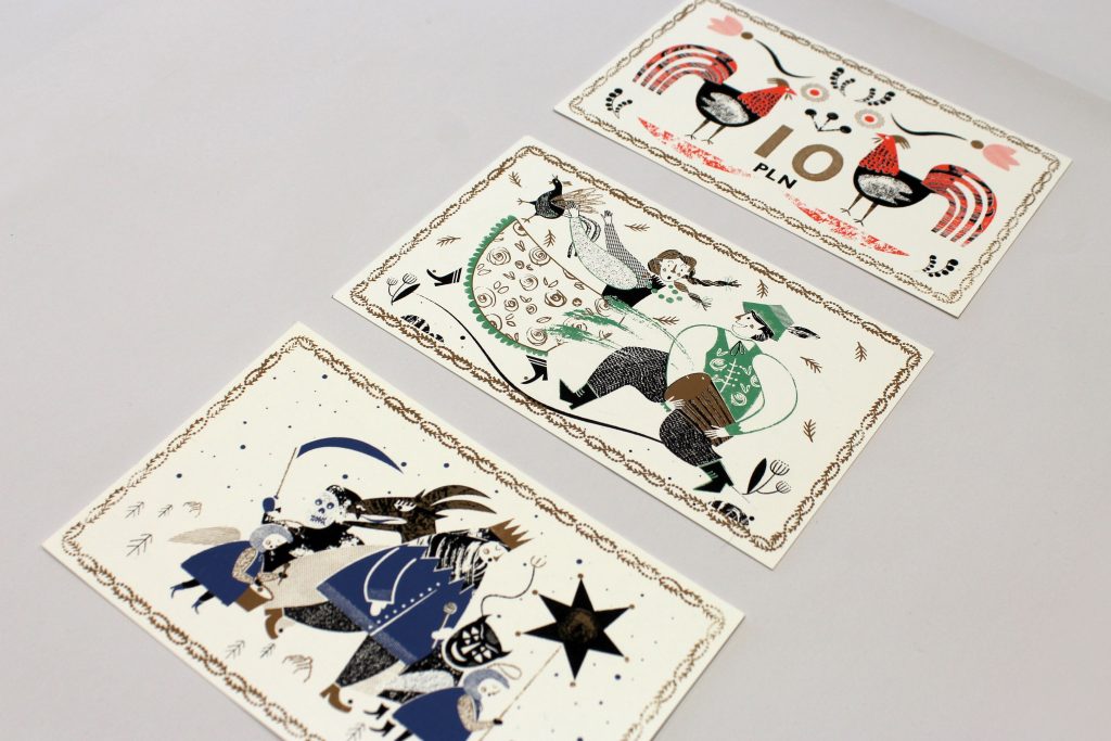
Polish folklore. Monika Stachowiak

Petra Wonham:

My Notgeld notes are based on tales of King Henry Vlll in Tudor Hitchin, I have used a variety of techniques to print them such as lino, riso and letterpress, and I have kept to a simple colour palette. The denominations are based on money used in Tudor times.
[Henry VIII used to hunt in the countryside around Hitchin. The Notgeld illustrates the local tale that he fell in the river – either because he tried to vault over it and his pole broke, or he fell off his horse during the chase]

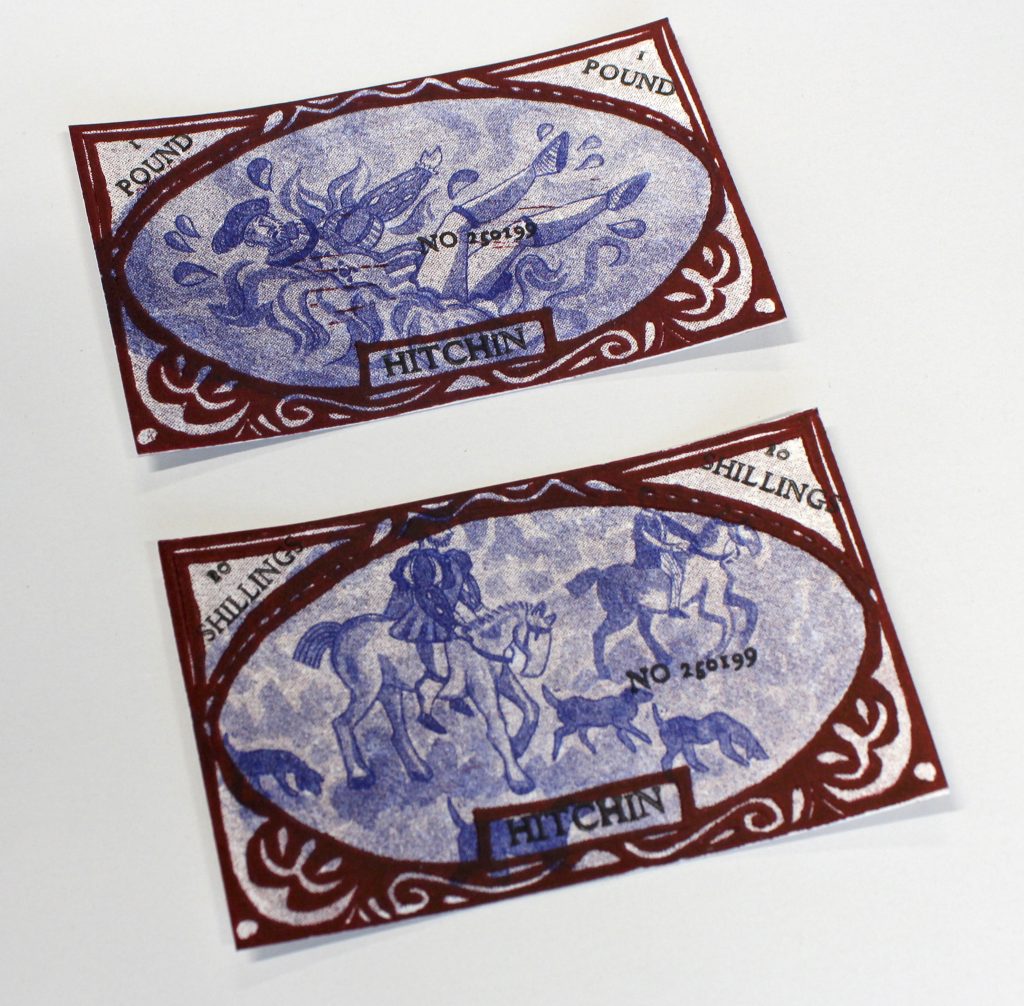
King Henry VIII visits Hitchen, Hertfordshire. Petra Wonham.

Tiggy Wilkes:

Designs inspired by folk tales and superstitions from my home county, Norfolk. The Black Shuck, a werewolf who roamed the coast, The Pedlar of Swaffham who dreamt he found treasure in his garden, and The Ogre of Smeeth who occupied a forest for many years until he was slayed. I created them in an old 18th century style, as if they were warnings and tales to inform the locals at the time.
Created using letterpress and lino relief printing.

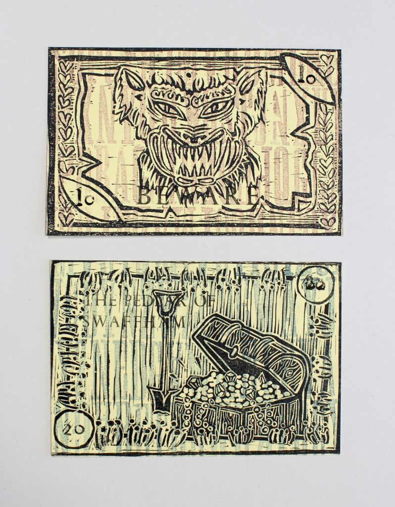
Norfolk folklore. Tiggy Wilkes


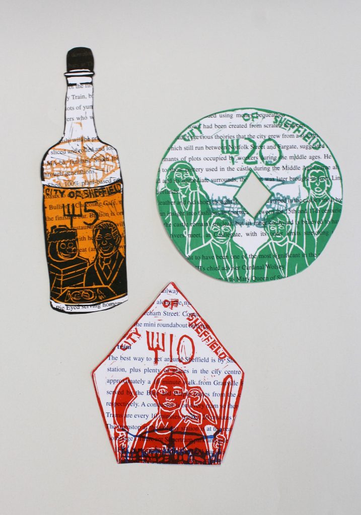
Our apologies for including this final entry in this post, where it seems not to belong. We had hoped to pay more attention to examples of Notgeld using interesting units of currency.  In post World-War I Germany some Notgeld was produced in unusual materials, including compressed coal dust, and many of the students thought about  their currencies very carefully.  You may have noticed Zhaoyang Chen’s Bank of Rabiland, in a previous post, counted in ‘Caro[t]s’, Naiomi Sun’s Utopian money is issued in units of time, and Rosie Cockrell’s Sheffield runs on units of forks. We thought that Zoe Zhou’s Bank of Sweets took the biscuit!

Zoe Zhou

For me this project is characteristic of time which reminds me of my childhood. In the set every note is quite different because I tried to show different side of that period. One of them is about the lovely children having sweets, rather than money, I believe sweets are valued by them. The other two are about my hometown and my favourite place to go with my parents, the aquarium.

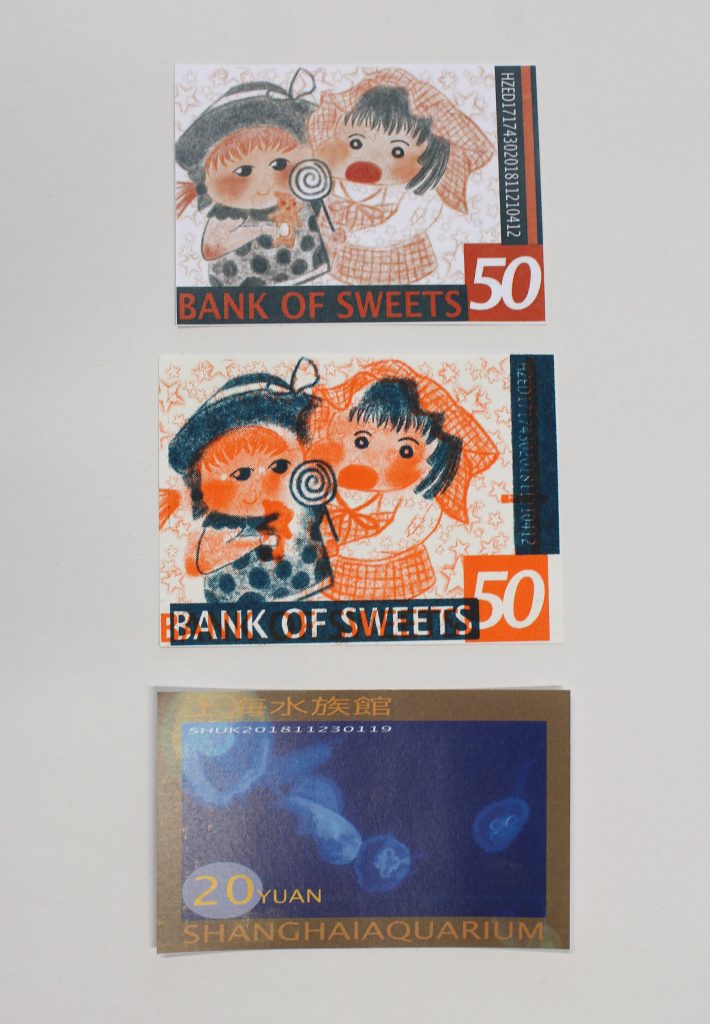
Bank of Sweets. Zoe Zhou

Rare Books – Expect the Unexpected 4

Lace, Forks, The Arctic Monkeys and Golf

This is the fourth in our series of posts based on the current exhibition in the Library Gallery, and the project by Edinburgh College of Art Illustration students, based on the album of Notgeld, emergency money, from the early 1920s.

The original German Notgeld was produced for local use, which was frequently reflected in the design. In an earlier post we looked at student Notgeld which was inspired by landscape and heritage. In this post we feature the work of the students who celebrated local industry and popular culture, often humourously.

Rosemary Cockrell

The city my Notgeld are fo

The Goffr is Sheffield. The notes show different cultural aspects of the city. For example, one of my notes uses the colours red and blue to symbolise Sheffield’s two football teams. The note is a pentagon to reflect the shape of the team badge. One of my other notes is shaped like a Henderson’s Relish bottle, which is a sauce made in Sheffield. My final note is shaped like the Peak District logo.

Notgeld for Sheffield. Rosie Cockrell

The currency I made for the city also expresses an important part of the city’s history. It is inspired by the shape of a fork which symbolises Sheffield’s stainless steel industry.

Bank notes usually have prominent figures featured on them so I included some well-known celebrities who are from Sheffield. I chose Sean Bean, Jessica Ennis-Hill and the Arctic Monkeys.


Jade Hollick

I chose to explore the history of the lace industry in Nottingham looking at the importance of its role within the economy.

Nottingham Lace. Jade Hollick.

Gee Watson

I based my Notgeld on Leith, an industrial area with a lot of history and culture. Inspired by the variety of styles, colours and collectable nature of the University’s collection, I decided to create more abstract, palm sized notes. Using print and mixed media I explored the texture, sound and energy of the area that I call home.

Leith, in texture, sound and energy. Gee Watson

Young Lee

My work is about my favourite activities to do in Busan, South Korea, which is my hometown.

I have invented this special currency that can be used to pay for sports.

Notgeld for Busan, South Korea. Young Lee.

Alison Laing

My Notgeld notes are an example of what the currency may be like if Scotland gained independence. I took a more humorous approach when exploring themes of architecture, royalty and famous Scottish figures whilst using a strict colour palette of blue, white and black.

Currency for an independent Scotland.


The exhibition includes a few items which are unexpectedly humourous, for a University Library.  The one which perhaps best complements this group of student Notgeld is the humourous poem about golf The Goff.  This, incidentally, like Gee Watson’s Notgeld, is set in Leith.  It records, in mock-heroic verse, a match between a young Edinburgh lawyer and a bookseller, on Leith Links.  In the passage reproduced below they see a group of senior players – the great and the good of Edinburgh – described as if they were the heroes of legend.

We are not sure whether ‘Golfina’, the goddess of golf, is present in modern Leith.

The Goff


Rare Books – Expect the Unexpected. 3

Hippogriffs, Rabbits, Skyship Ports and Mars: Fantasy Worlds

In our third visit to the student Notgeld and its connections with the exhibition, we move into the realms of fantasy. Some of the students realised that while their Notgeld needed a sense of place, they could improve on the world we have, and design for a better one.


Let us start by letting Naomi Sun lead us to the best of better places: Utopia:

“Here is UTOPIA.
A place for you to escape from the REAL.
You can finally be YOU,
though that will not be long.”

“Tickets are limited.
Please collect your notes and use them wisely.”
We were particulary impressed with Naomi’s work, as she was the only student to use etching to produce her notes.

Sammi Duong looked to Space, and made a better world on Mars:

“These banknotes are made for a future when we inhabit Mars and are named after the Mars Rover. Together they narrate the process in which humans made Mars habitable.
They were made digitally on Photoshop then risograph printed with red and gold ink.”

Zhaoyang Chen invented a world of rabbits.

“I designed these notes for an imaginary country populated by rabbits. The name of this country is Rabiland, I got the inspiration from Zootopia. The design and layout of the notes are based on modern Chinese notes.”
These also explore space: the third note of the set, which is in the exhibition but not illustrated here, shows the rabbits in very natty space suits.

Shannon Law and Valeria Mogilevskaya have both invented imaginary lands.

Shannon:

“My notes (Oceys) are for a fantasy fishing village that I based around some creative writing that my friend and I worked on. It originally was a market town with watchtowers surrounding it, I changed this due to the colour palette I was using and the style of buildings that were evident in medieval fishing villages.”


Valeria

“Ythers’Narth is a fictional country in a steampunk world, it is a mountainous and beautiful country which presents a scenic idyllic lifestyle to the rest of the world but in reality the strict laws and controlling government make life there far from free. These notes, issued by the capital city and carefully monitored by the nobility show parts of the country people are meant to look up to – the rich history and older civilization Ythers’Narth gets its name from and its people are descended from; the picturesque mountain ranges and fields of golden wheat; the immensely popular sky ship ports that people from all over the world fly to.”

The other exhibits some imagined lands – there are the examples from our collection of American comics, Batman, Spiderman and the irresistably-named “Ms. Tree”, which we cannot reproduce here for copyright reasons.

However, we can reproduce a fantasy creature, which would be worthy to inhabit any of the students’ fantasy lands. A hippogriff, from Ludovico Ariosto’s Orlando Furioso. In the story the knight Astolfo travels by hippogriff to Ethiopia (which is clearly off the edge of the page), to seek a cure for Orlando’s madness, brought on by being jilted in love.

Hippogriff, from Orlando Furioso

Alice’s Adventures in the Rare Book Stacks

Happy 150th anniversary of the second edition of Alice’s Adventures in Wonderland!

(This week’s blog post has been contributed by Tess Goodman, a doctoral student in the Centre for the History of the Book, who has been volunteering with us.)

Alice h
The second edition? Wait—what about the first edition? Well, the first edition of Alice, printed in 1865, was suppressed before publication. But don’t get too excited: this isn’t a tale of censorship. It’s a tale of quality control.
The 1860s are now sometimes called the golden age of book illustration. Cheap illustration technology was relatively new, and illustrated books were very, very popular. Even fiction for adults was usually illustrated: the first editions of works by Dickens and Thackeray, for example, were full of pictures. In the 1860s, even well-reputed painters like Dante Gabriel Rossetti and John Millais were producing work for books, and the average quality of illustration was higher than ever. Illustration could make or break a title.
Alice was illustrated by John Tenniel, a well-known cartoonist for Punch. The first copies were printed in the summer of 1865, and Charles Dodgson (who went by the pseudonym Lewis Carroll) began sending presentation copies to his friends before the official release.
But then Tenniel saw a copy. He thought that his illustrations had been badly printed. In fact, he found the printing so poor that he complained to Dodgson, who complained to the publisher, who canceled the entire edition. Macmillan reprinted all 2,000 copies. Dodgson sent letters to friends who had already received copies, apologizing for the quality. The rejected sheets were sold to a publisher New York, who published them in America with a new title page.*

Alice a
The second edition, published in 1866, was the first to appear in Britain. The pictures in this post are from Edinburgh’s copy of this edition, which is bound with a first edition of Through the Looking-Glass. Hopefully these pictures demonstrate what the fuss was about: these illustrations are spectacular.
Tenniel did forty-two illustrations for Alice. They were so popular that for Through the Looking-Glass, he did fifty. These pictures brought, and bring, joy to everyone who sees them—except their creator. Tenniel found Dodgson so pernickety and difficult that he almost refused to work on Looking-Glass; it took Dodgson and Macmillan years to convince him. Afterwards, he wrote: ‘with Through the Looking-Glass the faculty of making drawings for book illustration departed from me… I have done nothing in that direction since…’. ** (60). And he never did again.

Alice b
Nevertheless, we’re glad to have these books at Edinburgh. As you can see from these pictures, our copies are in slightly poor condition. But most children’s books are very hard to find in good condition: the children reading them don’t worry about preserving them for future generations. In the case of Alice in Wonderland and Through the Looking-Glass, the binding might be rubbed and the joints might be shaky, but the printing is still impeccable.

Alice d

*That makes them the second issue of the first edition, if you are bibliographically-minded enough to care. The presentation copies that still had the British title page were the first issue of the first edition. Only fifteen are extant.
** Quoted in Sydney Herbert Williams and Falconer Madan. The Lewis Carroll Handbook: being a new version of A handbook of the literature of the Rev. C. L. Dodgson. Revised by Roger Lancelyn Green. London: Oxford University Press, 1962. P. 60.