Home University of Edinburgh Library Essentials
April 11, 2026
Trial access: Slavery, Abolition and Social Justice
Thanks to a request from a student the Library currently has trial access to Slavery, Abolition and Social Justice from Adam Matthew Digital. Bringing together primary source documents from archives and libraries across the Atlantic world, this resource allows students and researchers to explore and compare unique material relating to the complex subjects of slavery, abolition and social justice.
You can access the database via the E-resources trials page. Access is available both on and off-campus.
Trial access ends 20th February 2017.

Just my type of thesis: some notes on book production from 1915
The printed book as an artistic unity: A study of selected Incunabula as a Guide to the external production of worthy modern books
Richard Wilson, B.A. London
“The subject of the present enquiry is the external production of the printed book, viewed from the artistic standpoint, using the epithet in its broadest and best sense. It consists of three parts dealing respectively with typography, illustration and binding; and its object is to formulate rules for the production of modern books based upon a detailed study of selected historical examples drawn from the best period of printing.”
How could one not be excited by the start of this thesis? It contains reflections on some of the most interesting topics for someone interested in art and who works in a library: typography, book history and the artistic value of printed matter. I find the circumstances of this reading also, slightly ironic. I am reading about the originality of printing whilst creating a digital copy of a book and whilst, probably more ironically, a colleague of mine is chopping, dismembering and binning some duplicate copies of other theses.
Wilson argues that book production is a branch of fine art and it is hard to disagree with him especially if we consider some of the objects held here at the University of Edinburgh (Le Japon Artistique being one of them: http://tinyurl.com/joftha5) or if we head down to the bookshop and purchase anything published by Persephone. It is an art form that “comes home to ordinary people in a way that painting, sculpture, and even architecture can never do”. Reading a book is a visual and tactile experience one that could not replicated in the same way with artefacts such as a Rothko painting; and digital copies cannot replicate this experience either.
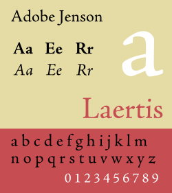
Adobe Jenson font modeled after the classic 15th century type
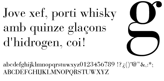
In this early 20th century thesis the author, Richard Wilson, focuses on the ‘architecture of the book’ dealing with three perspectives: typography, illustration and binding. The typography section is particularly informative and this is what I am going to explore a bit further. Wilson starts by outlining some of the principles of typography, the division of typefaces into: Roman and Gothic; “the former is now rarely used by English or American printers for book work. It was very handsomely employed in a variety of sizes by the early printers of northern Europe as well as by those of Italy for large folios and ecclesiastical works, and careful contemplation of the best of these books is absolutely necessary for all who wish to acquire correct taste in typography; but very early in the history of printing the Gothic was superseded by Roman type though it has survived in Germany to the present day. “ 102 years later the Roman typefaces appear in our digital documents under: Bembo, Baskerville, Garamond and of course Times New Roman fonts.
Wilson then reflects on the importance of the Jensen type for history of book-making. . It is no exaggeration to say that the Old Style Roman founts of type of which there are many varieties now in use are all based more or less directly upon Jensen [Jenson]’s type which possesses the necessary quality of restfulness.
The font takes its name from its creator, Nicolas Jenson a 15th century French publisher and printer. After some experience at the Royal mint of Tours, Jenson developed his printing know-how in Germany under Gutenberg. It is in Venice that he opens a printing shop and develops for the first time the printed roman lowercase type. The shapes and measures of this type refer even if lightly to handwriting and make the reader at ease when reading.
“A careful study of late fifteenth century books emphasises, the important fact that a type face designed for restfulness must not be too precise and clean in general effect however carefully each individual letter is shaped. Machine like precision and absolute mechanical perfection tire the eyes readily as the steady contemplation of an unbroken row of area railings or of spikes upon a garden wall, two things quite perfect of their kind.”[1]
Wilson argues that the Jenson convoys
“a general impression of curvature which is soft, pleasing, and restful to the eye as distinguished from the sharp-edged, flat and angular impression produced by the serifs of the Modern Romans. For the eye rests gratefully upon gentle curves while it is repelled by angularity. […] In the type of Jenson and others of his period there are many small irregularities which please the cultivated eve not merely because of their “quaintness” and historic interest but because they are restful. The physical reason for this is that the changed form or slight irregularity stimulates a fresh set of nerve terminals and gives the others a rest, just as relief is found in a broken railing or an iron standard of different shape and heavier build.”
The Jenson type clearly shows that reading should be, at least visually as comfortable and soothing experience. But early modern fonts have their disadvantages too.
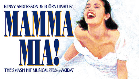
“To the modern eye, however, this earliest of the Roman types appears in its original form to be somewhat affected while it is unnecessarily wasteful of space; and if taken as a model it requires somewhat radical adaptation in several respects to meet the everyday requirements of a generation which reads a thousand books where the people of Jensen’s time read one. This wastefulness of space was probably one of the chief reasons for the designing of the first of the type faces classed as Modern Roman which came from the foundry of Giambattista Bodoni who settled in Parma in 1768. His types have been altered and adapted in many- ways but we may truly say that as Jensen is to the Old Style Romans so is Bodoni to the Modern Romans.
Developed by Giambattista Bodoni in the late 18th century, this serif is still popular and we can find examples of its uses in the Mamma Mia! Movie poster (both for the older and newer versions) and in the Nirvana band logo (here Bodoni is slightly compressed).
![]()
Space and readability are key elements of good book-architecture but so is the ‘ink’ used, when it comes to both thickness and colour.
“The designer must also avoid the clumsy blackness which is so often and so mistakenly, deemed to be necessary for legibility. Many of these “artistic” founts of type have a staring effect which is not conducive to restfulness in reading.”
The ink should not be allowed to ink on the page as texts should ideally avoid too many bold characters. The use of colour clearly helps the reader:
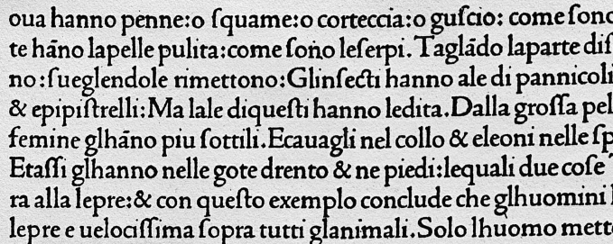
“In the library of Edinburgh University there are two volumes of the Biblia Latina by Anton Koberger ,1487. The books are not brilliant examples of typography but, together, they show an excellent, manner, by force of contrast, the optical value of the second colour in printing. In the first of these two volumes spaces have been left for the initials to be inserted by hand but the work has been left undone as in so many other of the incunabula. In the second volume the coloured initials have been inserted by hand and the effect, in comparison with the companion volume is more than pleasing. It is distinctly helpful to the eye of the reader, for the reason already given, that the occasional occurrence of clear bright colour in the black type stimulates at intervals a new set of nerve terminals. The revival of this plan of printing in two colours in ordinary books of the present day would greatly help in the attainment of restfulness in reading.”
But the use of colour should be moderate and only reserved to titles and the initial letter of a paragraph.
“There is nothing more ineffective than the attempt to obtain variety by merely printing a headline or capital in a bright colour without increasing the weight of the letter. As a rule the incunabula set us the example of aspiring use of colour in typography; but the copy of the Aberdeen Breviary printed by Walter Chepman in 1509, now in the University Library at Edinburgh, though a splendid piece of two-colour typography, is useful rather as a warning showing clearly the disadvantage of red type for .the body of a book. The eye is at once repelled by the pages of this book which are set completely in red type.”
In the rest of the thesis Richard Wilson talks about line spacing, optical round and flat lines, incunabula’s binding and illustration. But I thought I would concentrate on the timelessness of types here. Created in the early modern period, discussed artistically in 1915s and still present and used in current times, fonts emerge in many forms of printed and digital matter. They are often taken for granted and yet they make such a difference to our reading experience.
I was struck by the originality of this thesis, it is hard to find early discussions of book production focusing primarily on aesthetic value of the item.
Considering aesthetic as a main factor. I wonder if Richard Wilson would have been ‘repelled’ by how OCR and file reduction degrade the quality of the reading experience.
Wilson’s thesis will be available on ERA soon, please give it a look.
Early uses of the Jenson type found in Wilson’s thesis
Sample letters of Bodoni font
[1] I wish it was still acceptable to write like this in academia
New Law E-Books
![]()
We have added a further 16 e-books to our Brill Law collection packages. See the list of additions here.
New to the Library: Online Egyptological Bibliography (OEB)
I’m happy to let you know that following a successful trial last semester the Library has now got a 1 year subscription to the Online Egyptological Bibliography
from the University of Oxford.

The Online Egyptological Bibliography (OEB) holds the largest available collection of references in Egyptology literature, with coverage from 1822 to the present.
You can access OEB via the Databases A-Z list. Read More
Academic Book Week – free e-books from Brill
![]()
To celebrate Academic Book Week, Brill has made available 23 related e-books until Saturday 28th January.
Access the e-books from http://www.brill.com/free-ebooks-during-academic-book-week-2017
Travel writing from the Holy Land : The William Fulton Jackson Collection
A post by guest curator Suzi Higton, School of Divinity
The books of intrepid travel writers whose adventures span from Jerusalem to Cairo feature throughout the collections at New College Library and in particular, those gifted to the library by William Fulton Jackson. A selection from this collection is now on display in New College Library.
Born in 1855, Jackson, recently uncovered as the donor of the W. F. Jackson (WFJ) collection, was the General Manager of the North British Railway Company. His interest in and passion for travel, particularly the Holy Land and Egyptology is reflected both in his numerous books on the subject and detailed photograph collection which is held by the Glasgow University Library Archives.

Newton, Richard. Rambles in Bible Lands Edinburgh: Gall and Inglis, New College Library, WFJ. 3.166
When selecting books from the WFJ collection to display, the eye is immediately drawn to the books’ beautiful cover designs, maps and illustrations. Rambles in Bible Lands stands out, not just for its intricate artwork but for being aimed at a younger audience. Written by the Reverend Richard Newton, it was published initially whilst he was editor of the American Sunday-School Union, and is based on a series of letters written to Sunday-School World and A Child’s World whilst travelling through Syria, Israel, Lebanon and Egypt. Read More
Trial access to Oxford Scholarly Authorities on International Law

We have trial access until 31st January to Oxford Scholarly Authorities on International Law
This resource contains full-text online editions of market-leading reference works and treatises published by Oxford University Press, such as Oppenheim, and the Oxford Commentaries on International Law. Together with Judge Bruno Simma, books in the following four categories have been selected for inclusion:
- Authoritative treatises, which continue to define their area of law
- Black-letter reference works and commentaries, which will help you to answer practical questions about the law
- Classic works on international law, which remain influential in their field today
- Flagship publications, which provide innovative perspectives on current legal problems
All titles are fully searchable and browsable by subject matter, title and author, and are linked, via the Oxford Law Citator, to relevant case reports and articles within all of Oxford University Press’s online law products.
We are interested in your opinion on whether to subscribe to this resource or not. This can be done by completing a trial feedback form
All e-resources currently on trial can be found listed on our Trials Webpage.
Gale Primary Sources drop-in session Monday 30th Jan in Main Library

Get the most from our digital archives through Gale Primary Sources
Gale Primary Sources is an extensive digital archives programme spanning multiple disciplines and cultures. The platform uses specialist technology and tools to cross-search the Gale digital archives that our institution has access to.
See for yourself!
We have access to Gale Primary Sources through the Library. Join us to see how you can use this platform to enrich your research and improve your grades:
Monday 30th January
10am – 4pm (drop in)
Main Library – George Square
Want to know more about Gale Primary Sources?
When you explore Gale Primary Sources, you’ll discover original, first-hand content – meticulously cross-referenced to bring the facts into focus and the information to life in remarkable new ways. This digital platform provides an enhanced research experience with reliable search results. You can conduct one search and easily see related resources from extensive digital archives in one place. Find out more here » For more information about this drop-in workshop or on Gale Primary Sources, please email emea.marketing@cengage.com
Trial access: Digital National Security Archive (DNSA)
*The Library currently has access to Digital National Security Archive (DNSA) until 31st July 2024 as part of ProQuest Access 350.*
And finally…We currently have trial access to the extensive primary source database Digital National Security Archive (DNSA) from ProQuest. This database unlocks a vast trove of important declassified U.S. government documents providing vital primary source material to advance research in twentieth century history, politics, and international relations.
You can access the database via the E-resources trials page. Access is available both on and off-campus.
Trial access ends 15th February 2017.

Trial access: The NAACP Papers Collection
*The Library now has access to the NAACP Papers Collections until 31st July 2024 as part of ProQuest Access 350.*
Thanks to a request from a student in History, the Library currently has trial access to The NAACP Papers Collections 1-6, part of ProQuest History Vault. These collections are the digitised archives of the National Association for the Advancement of Colored People (NAACP). The archive covers the period 1909-1972.
You can access the database via the E-resources trials page. Access is available both on and off-campus.
Trial access ends 15th February 2017.

Collections
 Hill and Adamson Collection: an insight into Edinburgh’s past
My name is Phoebe Kirkland, I am an MSc East Asian Studies student, and for...
Cataloguing the private papers of Archibald Hunter Campbell: A Journey Through Correspondence
My name is Pauline Vincent, I am a student in my last year of a...
Hill and Adamson Collection: an insight into Edinburgh’s past
My name is Phoebe Kirkland, I am an MSc East Asian Studies student, and for...
Cataloguing the private papers of Archibald Hunter Campbell: A Journey Through Correspondence
My name is Pauline Vincent, I am a student in my last year of a...
Projects
Cataloguing the private papers of Archibald Hunter Campbell: A Journey Through Correspondence
My name is Pauline Vincent, I am a student in my last year of a...
Archival Provenance Research Project: Lishan’s Experience
Presentation My name is Lishan Zou, I am a fourth year History and Politics student....