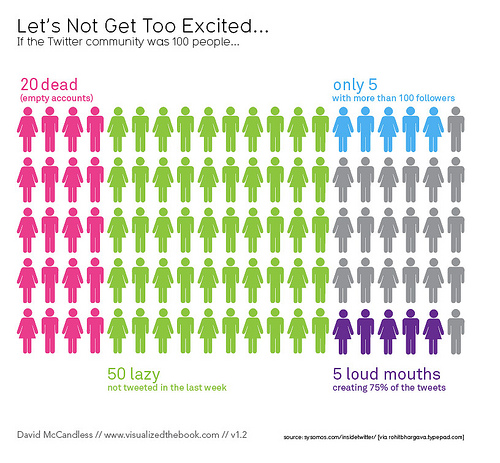
Data visualisation is a powerful method to either explore or explain your data. A number of online tools have emerged in recent years making it easier for lay people to make their information beautiful, in the words of dataviz guru David McCandless.
Martin Hawksey from CETIS at University of Strathclyde gave a talk to Information Services staff last week on this popular topic. Following the talk, a small group including the Data Library team had a discussion about what sort of training course might be of interest to the University research community.
Martin’s abstract:
There are a number of examples throughout history where visualisations have been used to explore or explain problems. Notable examples include Florence Nightingale’s ‘Mortality of the British Army’ and John Snow’s Cholera Map of London. Recently the increased availability of data and software for analyzing and generating various views on this data has made it easier to generate data visualisations. In this presentation Martin Hawksey, advisor at the Jisc Centre for Educational, Technology and Interoperability Standards (Cetis), will demonstrate simple techniques for generating data visualisations: using tools (including MS Excel and Google Spreadsheets), drawing packages (including Illustrator and Inkscape) and software libraries (including d3.js and timeline.js). As part of this participants will be introduced to basic visual theories and the concepts of exploratory and explanatory analytics. The presentation will also highlight some of the skills required for discovering and reshaping data sources.
Martin Hawksey’s presentation and blog post
Would you be interested in a data visualisation training course? We’d love to hear from you at datalib@ed.ac.uk or in the comments below.
Robin Rice, Data Library

Pingback: Dabbling in data visualisation | Research Data ...