Home University of Edinburgh Library Essentials
July 14, 2026
Meet Holly, Our Skills for the Future Placement
Posted on May 15, 2014 | in Archives, Featured, Library & University Collections | by ahawkinsMy name is Holly and I am currently on a two week placement at ECA Archives as part of my Skills for the Future Collections Trainee programme at RCAHMS.
I began my placement here on Monday and was introduced to the department and given a tour of the CRC by Rachel Hosker, the ECA Archivist, as well as an introduction to the great art collection by Neil Lebeter , the Art Collections Curator.
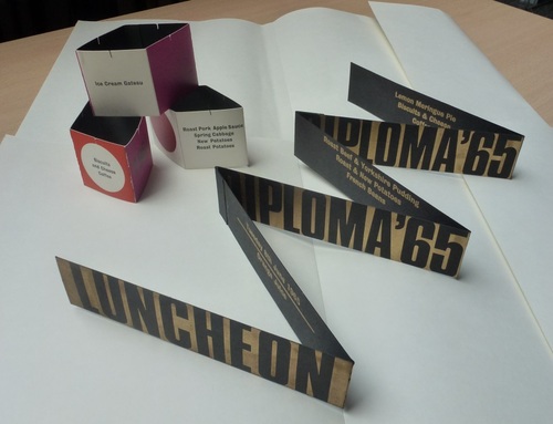
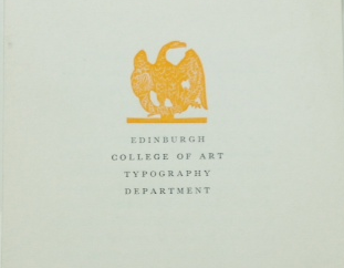
Over the next couple of weeks I will be working with the ECA’s typography collection, cataloguing and researching the material produced by the ECA’s typography department between 1930 and 1970. The collection is a varied and visually exciting one with items ranging from book covers to 3D menus for the student’s Diploma Luncheon. The material provides a good opportunity to get to grips with a collection of which little is known. A lot of the material is not attributed to a person and there is very little research material available about the work of the typography department at ECA. It is therefore important to spend time trying to understand the archive and to cataloguing it to increase public access.
The college ran The Eagle Press, named after a statue of an eagle that sits atop the press. Hopefully I will get the opportunity to see The Eagle Press at some point over the next two weeks which still resides at ECA. It is not known when The Eagle Press started however the earliest date I have found so far on a printed item from The Eagle Press is 1948.
As well as producing students work the college also printed commercial work. Amongst the collection there are an array of leaflets, menus and brochures for various businesses.
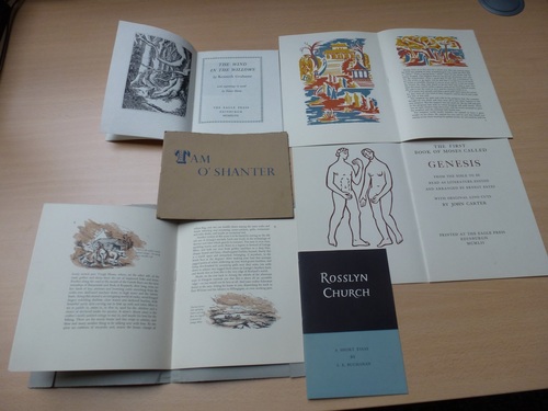
Whilst looking through the collection I found a lot of illustrated booklets that contain extracts from well-known texts such as Moby Dick and The Wind in the Willows. These booklets often have the name of a student from ECA as well as their class year and kind of typography they used printed on the back, providing an insight into the typography class. Some of the booklets have beautiful illustrations and are printed on a range of interesting papers.
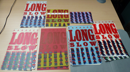
Whilst I have only just begun sorting through the collection I already have some favourites. I particularly like a series of colourful prints with the words A Long, Slow Repeat. There are sixteen prints in total, each using different combinations of coloured ink and papers that really give you the sense of a student experimenting and trying out different combinations in a typography class.
Holly Watson
Collections
 Hill and Adamson Collection: an insight into Edinburgh’s past
My name is Phoebe Kirkland, I am an MSc East Asian Studies student, and for...
Cataloguing the private papers of Archibald Hunter Campbell: A Journey Through Correspondence
My name is Pauline Vincent, I am a student in my last year of a...
Hill and Adamson Collection: an insight into Edinburgh’s past
My name is Phoebe Kirkland, I am an MSc East Asian Studies student, and for...
Cataloguing the private papers of Archibald Hunter Campbell: A Journey Through Correspondence
My name is Pauline Vincent, I am a student in my last year of a...
Projects
Cataloguing the private papers of Archibald Hunter Campbell: A Journey Through Correspondence
My name is Pauline Vincent, I am a student in my last year of a...
Archival Provenance Research Project: Lishan’s Experience
Presentation My name is Lishan Zou, I am a fourth year History and Politics student....