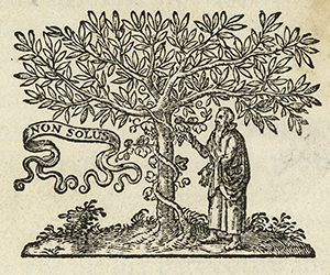
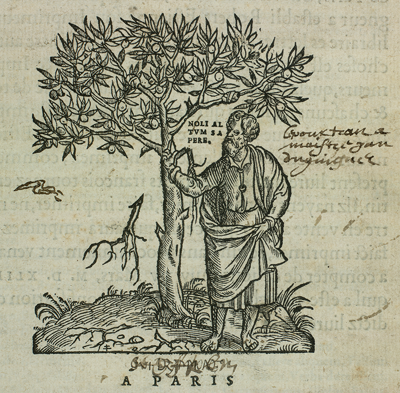
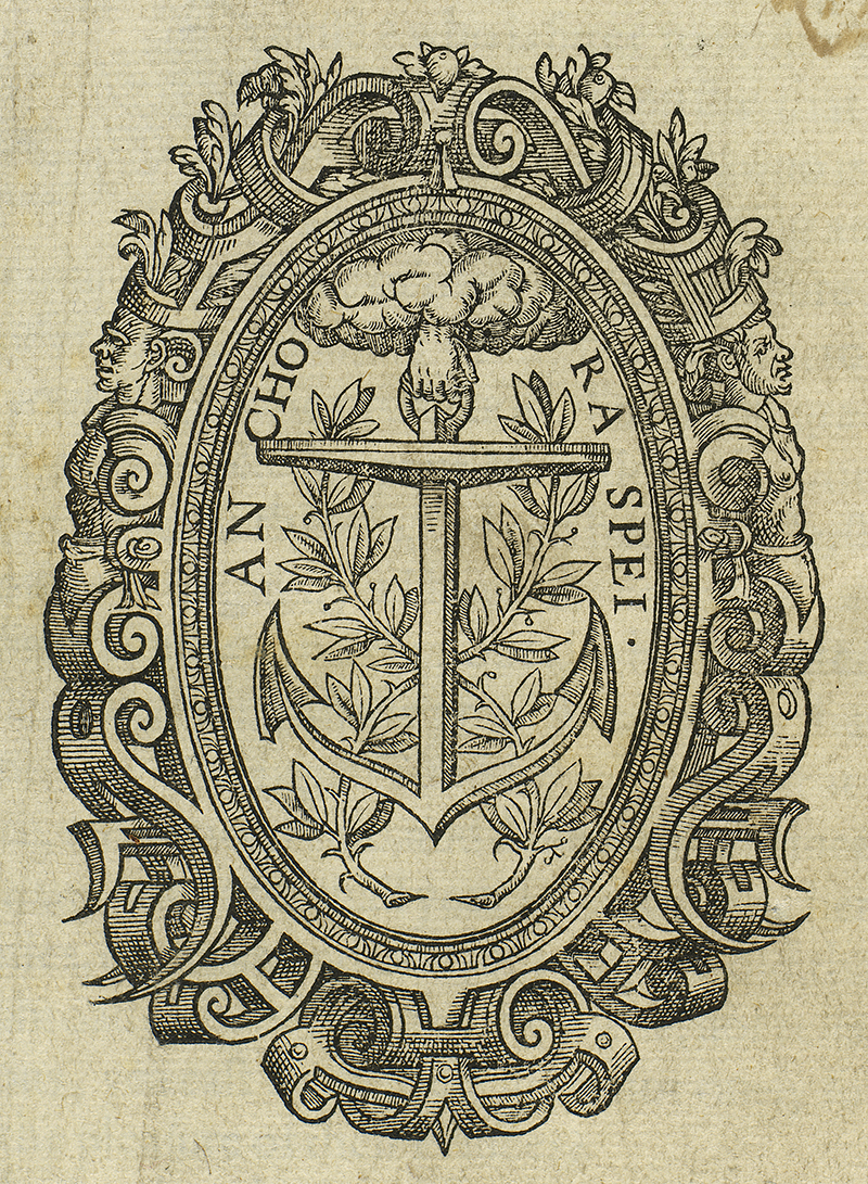
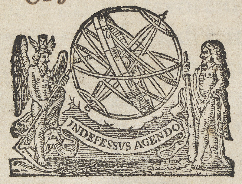
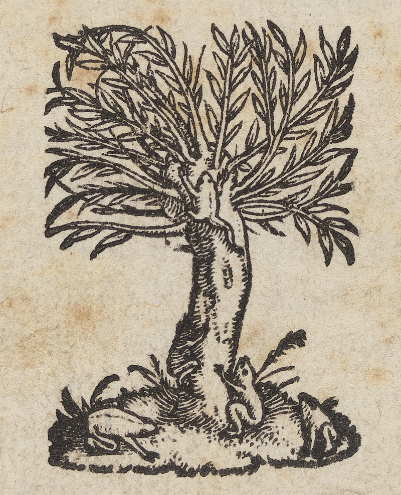
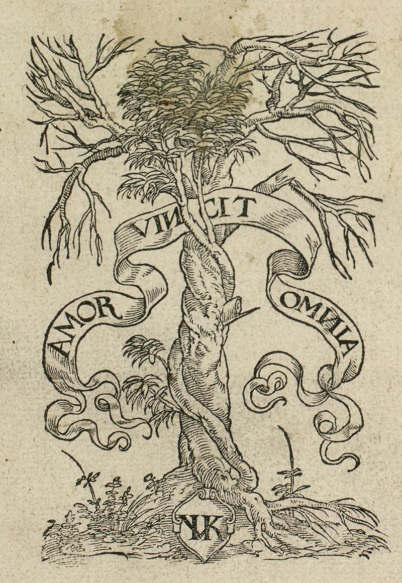
Having a background in Fine Art through study at Glasgow School of Art I am very aware of the striking visual content that passes through the Digital Imaging Unit on a daily basis. Of particular interest to me over the years of working with rare books is Colophon and Logotype. “This originated in Renaissance printing shops, where a title page would feature the printer’s mark (colophon) near the bottom of the page, usually above the printer’s name and city.” This early form of branding is fascinating in its use of imagery and the expert hand skills used to convey a meaningful message. The tree of knowledge is a popular symbol often appearing with broken branches. The level of thought over the imagery and the care taken over the execution is a remarkable investment in brand and product. The Colophon was eventually replaced by printers statements in a more legal and business like text form. Colophon have begun to re-appear for websites and online content publishing, this is a nice nod of the head over centuries of time to the continuation of a craft persons expertise and skill set.
Malcolm Brown, Deputy Photographer.

Great images, Malcolm. Are these collected in the Library Gallery?
Many thanks Peter. All of these images can be found on http://images.is.ed.ac.uk/luna/servlet/UoEgal~5~5
Nice post again, Malcolm. An artist’s eye on the colophon. John
Thanks John.