We are pleased to announce a new look and feel to the Edinburgh Research Archive (ERA). Over the past few weeks our Library Digital Development team have been busy upgrading ERA to a newer version of DSpace.
The main differences you might notice are:
- a responsive user interface design
- an improved discovery search/browse option which allows new filtering options
- several improvements to help Google Scholar better index the content
- lots of under the bonnet improvements and bug fixes
Full screen v smartphone view
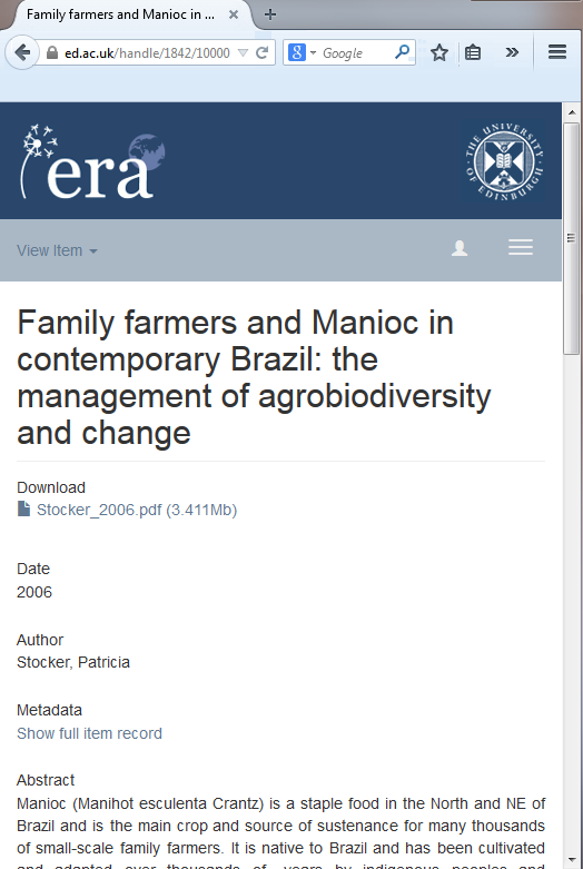
The responsive user interface design helps to make ERA look good on screens of all sizes from widescreen monitors to smartphones. Instead of squeezing everything from the large screen onto smaller screen size displays some information is dropped. Can you spot all the differences?
The text is dropped from the dark blue banner, the breadcrumb links in the light blue bar under the banner are condensed, the left hand side navigation panel is collapsed by default but can be toggled by the list icon, and the item abstract is re-positioned underneath the download and main metadata display.
For those that are interested ERA is now running DSpace version 4.2 (with some local mods including security updates), whilst running the Mirage 2 theme.


